STRATEGY BRANDING PACKAGING DESIGN WEBSITE
Born from the idea that skincare should be honest, effective, and mindful, Organzy represents a new generation of conscious beauty brands. This case study highlights Antraajaal’s approach to building Organzy’s brand identity—where minimal design, clarity, and purpose come together.
Brand Story
Organzy was born from a simple belief—that skincare should be honest, intentional, and in harmony with nature. Rooted in mindful self-care, the brand celebrates purity over excess and effectiveness over exaggeration. Each formulation is thoughtfully crafted using carefully chosen ingredients that respect both skin and environment. Organzy stands for clarity—clean compositions, transparent choices, and a calm approach to beauty. Designed for those who value balance and authenticity, Organzy transforms everyday skincare into a quiet ritual of care, confidence, and conscious living—where simplicity becomes the ultimate form of luxury.
BRAND PILLARS
Trust & Credibility
We build confidence through transparency, ethical practices, and reliable information. Our commitment to honesty and professional integrity ensures long-term trust with every user.
Quality & Excellence
We strive for excellence by maintaining high standards in services, expertise, and execution. Every process is designed to deliver consistent quality and measurable results.
Accessibility & Support
We believe in being easily accessible and responsive. Our user-friendly approach and dedicated support ensure help is always available when needed.
Innovation & Care
We embrace modern solutions while keeping a human-centric approach. By combining innovation with genuine care, we deliver personalized and future-ready experiences.
LOGO CONCEPT
The Organzy logo embodies luxury, purity, and timeless elegance. The bold blackletter typography conveys heritage, authority, and craftsmanship, reinforcing the brand’s commitment to high-quality, refined cosmetic formulations. The circular emblem and ornamental flourishes symbolize wholeness, balance, and natural harmony, reflecting Organzy’s focus on beauty that is both organic and holistic. The stylized “O” mark serves as a strong standalone brand seal, suitable for packaging, embossing, and premium applications.
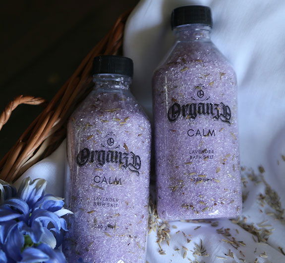
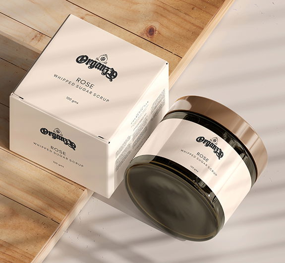
Packaging
Organzy’s clean and aesthetic packaging is designed to reflect purity, simplicity, and mindful beauty. Using minimal layouts, soft natural tones, and refined typography, the packaging allows the product and its ingredients to take center stage. Every element is intentional—free from clutter, visually calming, and aligned with a modern yet timeless aesthetic—creating a sense of trust, elegance, and effortless luxury that resonates with conscious self-care.