HUNKA
HUNKA
TOWN
CHANDIGARH'S
MOST SOULFUL
FINE DINE
Hunka Hunka Town arrived with a name, a logo, and a big personality. It needed a full brand ecosystem to match.
Hunka Hunka Town is not your typical fine dine. Built around the energy of rock-and-roll, vintage Americana, and the warmth of a live music venue — it occupies a category of its own in Chandigarh's restaurant scene. The vinyl record at the heart of its logo isn't decorative. It's a declaration: this place has a soul, and the food is the soundtrack.
The logo existed. What didn't exist was the brand infrastructure to bring it to life across every surface, screen, and serving. No brand manual, no professionally designed menu, no indoor branding system, no campaign-quality photography, no social media strategy, and no website. Antraajaal was brought in to build it all — and to build it in a way that matched the bold, unapologetic personality already baked into the mark.
Take this incredible logo and build an entire world around it. Every wall, every page, every post, every photograph should feel like it belongs in the same room as that vinyl record.
THE CONSTITUTION
OF A ROCK KITCHEN
A restaurant with this much personality needed a brand manual that could contain it — and direct it. Antraajaal created a comprehensive brand manual for Hunka Hunka Town that covered every dimension of how the brand communicates, from the exact Pantone value of the amber yellow to the approved vocabulary for a social media caption.
The colour system — black, amber yellow, distressed cream — was codified with CMYK, RGB, and Pantone references for both print and digital application. Typography was paired: the display font carries the rock-concert poster energy; the body type grounds it with legibility for menus, signage, and website copy.
The manual's tone of voice section was particularly detailed — because a fine dine with rock-and-roll soul speaks differently to a luxury hotel or a casual bistro. Hunka Hunka Town's voice is warm, confident, a little irreverent, and always steeped in music and food culture. This distinction was the foundation every piece of content was built on.
A brand manual for a restaurant like this isn't a rulebook — it's a backstage pass. It tells every person working with the brand what makes this place different, and how to keep it that way.
A MENU THAT PLAYS
BEFORE THE FOOD ARRIVES
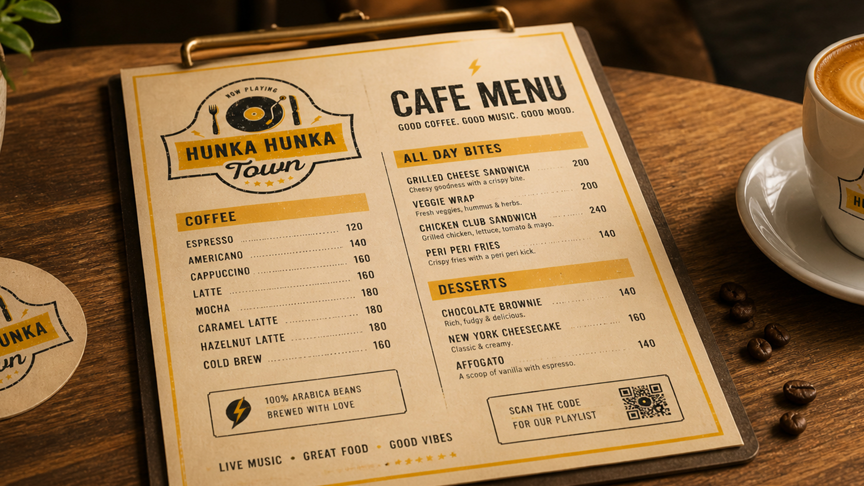
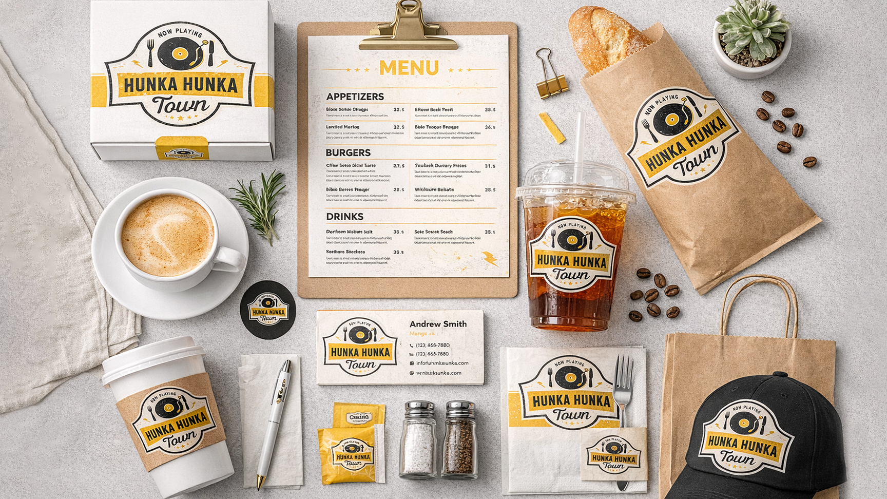
The Hunka Hunka Town menu was designed as a collector's object. The cover carries the full badge identity — vinyl record, fork-and-knife, wheat ears, lightning bolts — printed on thick matte board with a spot UV on the logo. Opening the menu is the first performance of the evening.
Inside, every section is named in the brand's voice — appetisers become "The Opening Act", mains are "The Main Set", desserts are "The Encore". The typography mixes display Bebas energy with a hand-script typeface for section labels, maintaining the retro-rock character throughout. Food descriptions were rewritten by Antraajaal to match the brand's voice — evocative, specific, never generic.
A digital menu board version was produced for the restaurant's screen display — animated, using the same halftone dot patterns and amber yellow language. The bar menu received its own treatment: a narrower format, portrait orientation, with cocktail descriptions that read like setlists.
The menu is the first time a guest interacts with the brand at a table. It set the tone for everything — the food, the service, the experience. It had to feel like an artefact worth taking home.
EVERY WALL
A STAGE SET FOR
MEMORY
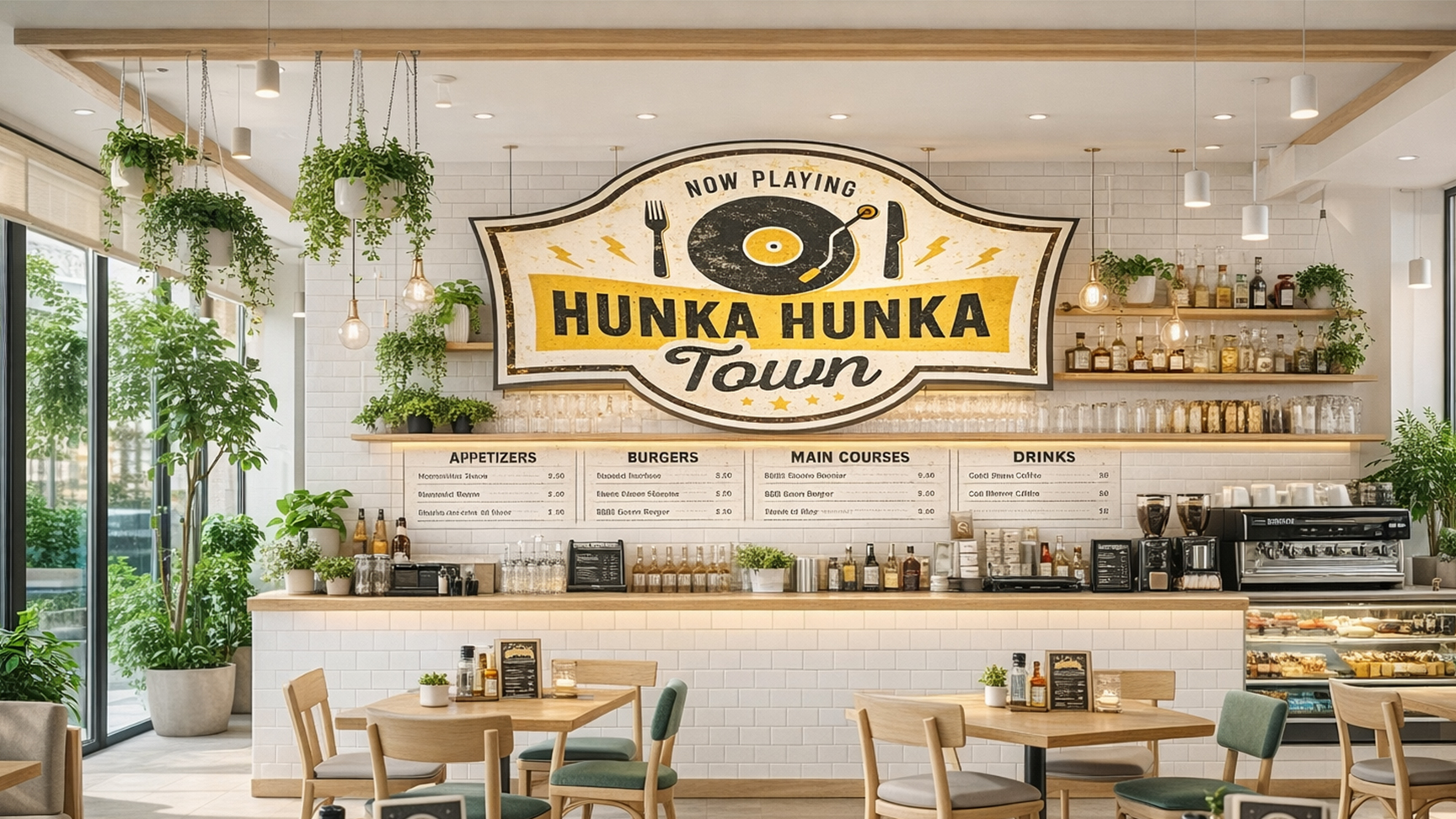
Hunka Hunka Town's interior was transformed into a total brand environment — where every wall, surface, and lighting decision told the same story as the logo.
Large-format vinyl murals combining the brand's retro illustration style — halftone portraits of rock legends, vinyl records, music notes, and lightning bolts — in the brand's black-and-amber language. Designed to be the most-photographed backgrounds in the restaurant.
Entry fascia, directional signage, restroom labels, table numbers, and service counter signage — all within the brand system. Every sign in the restaurant communicates in the same voice, with the same aesthetic precision as the menu and the logo.
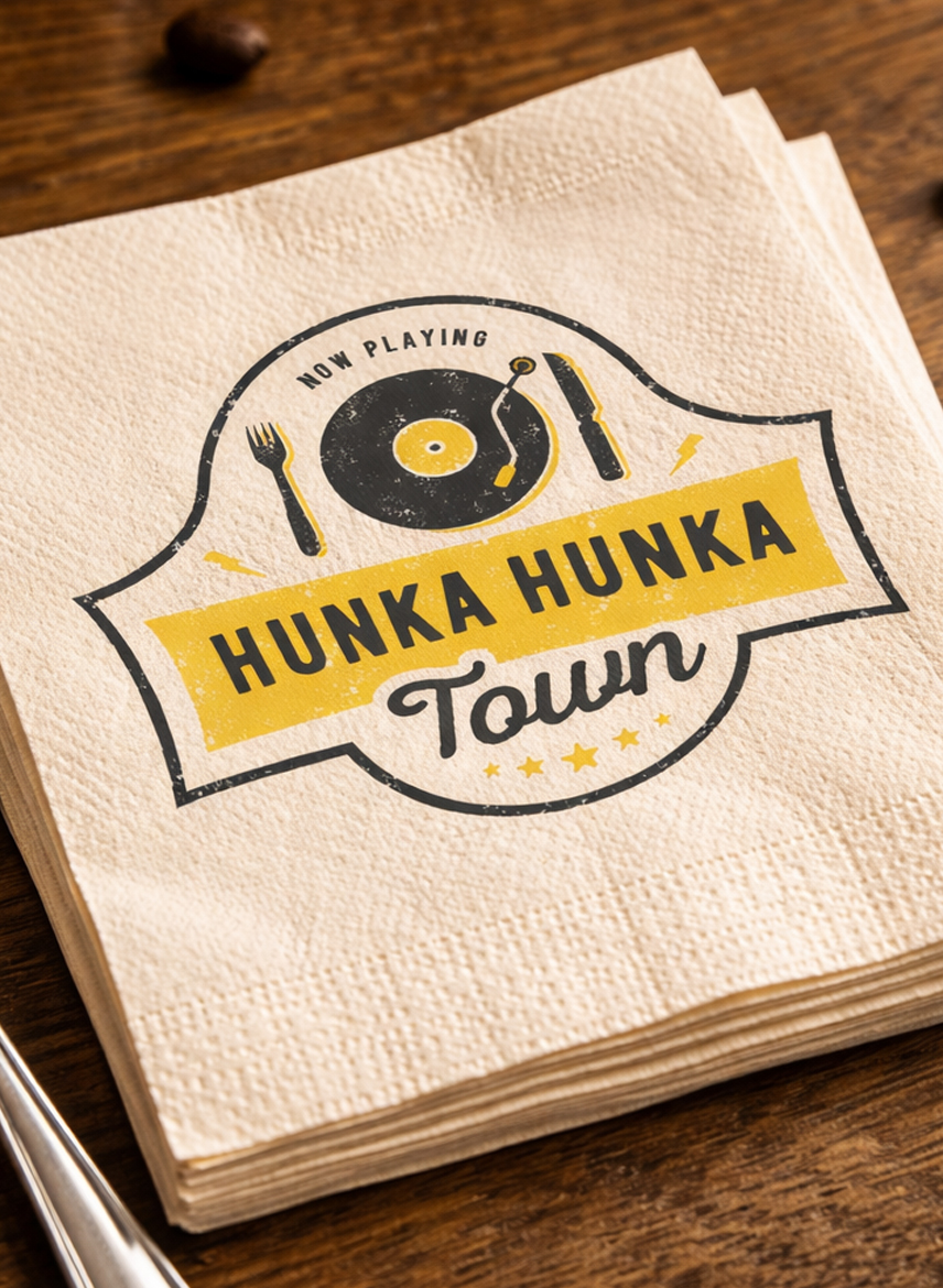
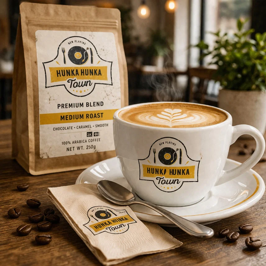
Table tents, coaster designs, and condiment station branding — small-format brand applications that keep the identity consistent at arm's length. The coasters were designed as collectibles, each featuring a different vinyl record illustration.
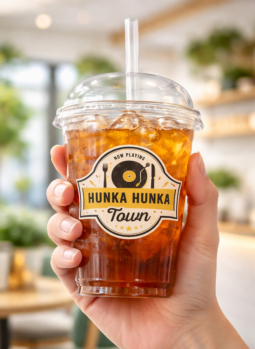
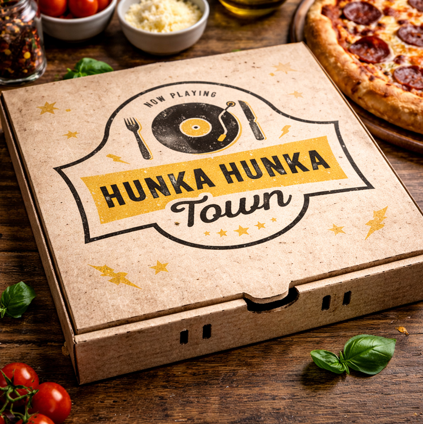
Carry bags, takeaway boxes, and food packaging — all printed in the brand's black-and-yellow system with the halftone dot background. A Hunka Hunka Town takeaway bag on a Chandigarh street became a moving brand advertisement.
MAKING FOOD LOOK
AS GOOD AS IT TASTES
Antraajaal directed and produced a comprehensive photography campaign for Hunka Hunka Town — covering food, ambience, and the energy of the space. The brief was specific: photographs that would look at home in a city food magazine but feel authentic to the rock-and-roll soul of the restaurant.
Food photography used dramatic lighting — deep shadows, warm tungsten tones, hero shots that made every dish look like the headliner. The colour palette of the food photography was calibrated to work with the restaurant's amber-and-black brand language: warm plates, rich textures, garnishes that caught the light like amber under a spotlight.
Ambience photography captured the evenings — the candlelight, the crowd, the live music moments — giving the restaurant a visual library to use across its social media, website, and PR outreach for months without requiring additional shoots.
The camera had to capture what made Hunka Hunka Town special — not just the food, but the feeling of being in that room on a Friday night when the music starts and the first drinks arrive.
THE INSTAGRAM THAT
MADE CHANDIGARH
HUNGRY
Hunka Hunka Town's social media was built to match the energy of a concert — each post an event, not just content. Three content pillars drove the strategy: Performance (food and drink photography that treated every dish as a headline act), Backstage (kitchen stories, chef features, ingredient sourcing — the behind-the-scenes that builds loyalty), and Community (live music event promotion, customer nights, user-generated content that made guests feel like they were part of the show).
Instagram Reels became the primary growth engine — music clips from live performances set to the restaurant's signature dishes, creating a sensory combination that the platform algorithm rewarded consistently. Within three months, Hunka Hunka Town had become one of Chandigarh's most-shared restaurant accounts.
Zomato and Swiggy listings were redesigned with the new photography library and brand descriptions — converting browser interest into active orders. Google Business profile was fully optimised with keyword-rich descriptions targeting "fine dine Chandigarh", "live music restaurant Chandigarh", and "restaurant branding Chandigarh".
Every post was a concert poster. Every caption was a setlist. The brand voice never broke character — because the character was that good.
THE WEBSITE THAT
TAKES RESERVATIONS
AT MIDNIGHT
The website was built as a full digital experience — not a listing page. It opens with a full-screen video loop of the restaurant in its evening energy: the music, the plates arriving, the crowd. The design follows the brand's retro aesthetic — dark background, amber accents, halftone textures, Bebas Neue display headers.
The site includes online table reservation integration, a digital menu section, an events calendar for live music nights, a photo gallery fed from the brand photography library, and an SEO architecture built around the keywords that bring hungry Chandigarh residents to restaurant discovery pages.
The website had one job beyond information: make a visitor who has never been to Hunka Hunka Town feel the FOMO of not having been there already — and immediately book a table.
It was a performance —
and Antraajaal built the stage for it.
THE NUMBERS
DON'T LIE
STANDING OVATION
Manual & Identity
- 50+ page brand manual delivered
- Colour, typography & tone of voice codified
- Logo usage and application rules defined
- Retro-rock visual system established
- All vendor specifications included
Space & Collateral
- Menu designed — food, bar, dessert versions
- Feature wall murals and indoor branding
- Full signage system across the restaurant
- Table identity — tents, coasters, packaging
- Photoshoot — food, cocktails, ambience, team
Social & Web
- 3× footfall growth in 6 months
- Instagram reach grew 450% in Q1
- Website with reservations & SEO launched
- Zomato and Google optimised — 4.8★
- #1 featured fine dine in Chandigarh media
Antraajaal understood that Hunka Hunka Town wasn't just a restaurant — it was a feeling. They built a brand system that carries that feeling into every menu, every wall, every post, every photograph. The restaurant looks and feels like the name sounds now.
— Founder, Hunka Hunka Town | Fine Dine | ChandigarhMORE HITS
FROM ANTRAAJAAL
YOUR RESTAURANT
DESERVES A STANDING OVATION
From fine dine to fast casual — Antraajaal does complete restaurant branding, menu design, indoor branding, social media and websites that put your venue on the map.