


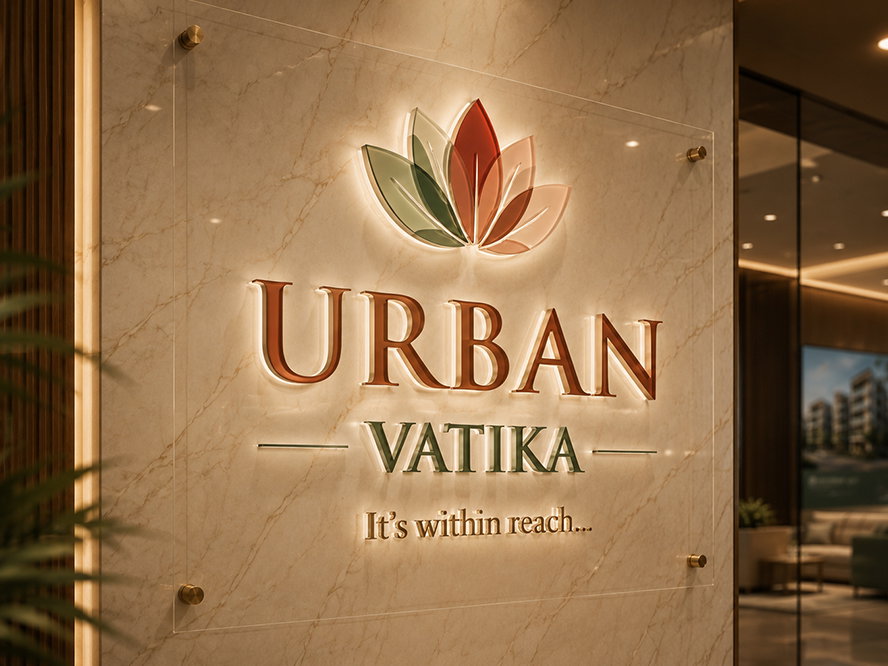
URBAN
Awaited
BHK
Colours as Fresh as
the Morning in a Garden
Urban Vatika's colour palette was Antraajaal's most defining creative act — every subsequent deliverable flowed from these four choices. Leaf green as vibrant and alive as the project's name promised. Sunshine yellow carrying warmth and optimism. Soft blush adding a touch of tenderness. Clean white as the canvas that made them all breathe.
These weren't chosen colours — they were felt ones. The kind of palette that makes someone smile when they see a hoarding on the road, keep a brochure on the coffee table, and save a post on Instagram.
A Garden in
the Heart of Zirakpur
Urban Vatika was not a project that arrived in a hurry. It was long in the making — and when it finally launched, it carried the weight of that anticipation and the confidence of a project that knew exactly what it was.
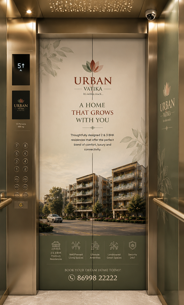
Positioned in Zirakpur on the Mohali boundary — one of Tricity's fastest-growing residential corridors — Urban Vatika offered 2 and 3 BHK apartments built around three non-negotiable commitments: Location, Quality, and Delivery. These weren't marketing claims invented after the fact. They were the developer's founding philosophy.
The project's unique architectural design set it apart from every competing development in the corridor. Contemporary yet warm, designed for families who wanted modern living without its coldness. The name Vatika — a garden — was embedded in every visual Antraajaal created.
Urban Vatika was worth the wait. Every piece of marketing had to make that case — not through noise, but through the beauty of a brand that knows exactly what it is.
Every Channel.
Every Surface. One Story.
A Brochure as Beautiful
as the View It Promised
The Urban Vatika brochure was printed on warm cream art paper, with leaf green as the primary design accent and soft yellow for highlights. The hand-painted oil-washed landscape aesthetic — the same one that made the project's cover illustration so striking — ran through every spread as the brand's artistic soul.
Floor plans were presented with generous breathing room. Amenities were written with warmth and specificity. The Location | Quality | Delivery promise ran through the copy as the proof framework, every claim substantiated. A digital version was produced for WhatsApp and email distribution across broker networks.
The Urban Vatika brochure had to feel like the project — warm, alive, and beautiful enough to live on a coffee table. Something a buyer would return to, not recycle.
Making Zirakpur
Stop and Smile
Urban Vatika's hoardings ran along the Zirakpur-Mohali corridor — the daily commute route of the project's primary buyer demographic. In a hoarding landscape of competing reds and blues, Urban Vatika's leaf green, yellow and white palette was joyful, warm, and instantly distinctive. It made people look twice — and remember.
Site hoardings along the project boundary turned the construction perimeter into a cheerful brand statement. Strategic unipoles at key junctions created layered familiarity — so that by the time a buyer encountered the project digitally or in print, they already felt they knew it and liked it.
The best hoarding doesn't shout — it charms. Urban Vatika's outdoor campaign made the corridor feel warmer. Buyers looked forward to seeing it on their daily drive.
Online as Fresh
as the Brand Itself
Website: The Urban Vatika project site was built in the brand's warm, natural visual language — leaf green accents, yellow highlights, clean white backgrounds. Floor plans, gallery, amenities, location map and lead capture were all optimised for mobile. SEO targeted "2 BHK Zirakpur", "3 BHK near Chandigarh", "apartments Mohali" — capturing high-intent organic searches alongside paid campaigns.
Social Media: Instagram and Facebook content was produced in Urban Vatika's bright, cheerful palette — photography bathed in natural light, green and yellow accents on templates, and a content mix of renders, lifestyle imagery, construction progress and location advantage content that made following Urban Vatika genuinely enjoyable.
Social media for a residential project has one real job — stay in the mind and heart of a buyer who is still deciding. Urban Vatika's content was beautiful enough to do exactly that.
Measurable Growth
Across Every Channel
A Campaign Worthy
of the Wait
Identity & Palette
- Leaf green, sunshine yellow, blush pink, white palette
- Typography hierarchy and visual language
- Brand voice and tone of voice guidelines
- Lotus motif system across all applications
- Identity consistent across every format
Physical Presence
- Premium brochure — hardbound + digital
- Hoardings along Zirakpur-Mohali corridor
- Site perimeter branding and unipoles
- Sales kit — folders, spec sheets, floor plans
- Joyful aesthetic distinct from all competitors
Campaign Outcomes
- 3× qualified lead growth vs pre-campaign
- 350% social media reach in 90 days
- 65% CPL reduction over 5 months
- Website with SEO for Zirakpur apartment searches
- 4.5★ average rating across property platforms
Urban Vatika was a project we believed in deeply — and Antraajaal gave it the brand presence it deserved. The colours, the brochure, the hoardings, the social media — everything felt alive and beautiful. Our buyers came in already knowing and loving the brand.
— Urban Vatika | Qualitative Living | Zirakpur, MohaliMore Real Estate
Campaigns We Built
GRAND
Golf Avenue