


ZAFEROON
A MUGHAL AFFAIR
From a nameless kitchen to Chandigarh & UP's most-loved eatery — how Antraajaal built every layer of a restaurant brand from the very first stroke.
A ROYAL KITCHEN
WITHOUT A NAME
The founders had a vision — to bring the grandeur of Mughal court cuisine to the streets of Chandigarh, with an authenticity that would travel all the way to Uttar Pradesh.
They had the recipes. They had the chefs. They had the ambition to create something that felt regal, warm, and deeply rooted in the tradition of slow-cooked Mughlai flavours. What they did not have was a name, a visual identity, a packaging system, or any form of digital presence.
Antraajaal was engaged to build everything — from the very first letter of the brand name to the last pixel of the website. This was a rare and total creative mandate: define the brand's language before a single plate was served.
 Insert: Founders / Kitchen Image
NAMING A
DYNASTY
Zaferoon. From the Arabic–Urdu root zafer (زفر) — meaning triumph, victory, the cry of the conquering. A name that carries weight without explanation. It sounds royal without being distant, ancient without being inaccessible.
Antraajaal's naming process mapped three dimensions: phonetic beauty in Hindi, Urdu, and English; cultural resonance with the Mughal culinary heritage; and trademark viability across food & beverage classes in India. Over forty candidate names were evaluated before Zaferoon emerged — inevitable in hindsight.
The tagline "A Mughal Affair" was crafted simultaneously — positioning the brand not as a restaurant but as an experience. An affair implies intimacy, excitement, and a secret worth sharing. It turned every meal into something more than food.
THE ICON OF A
MUGHAL KINGDOM
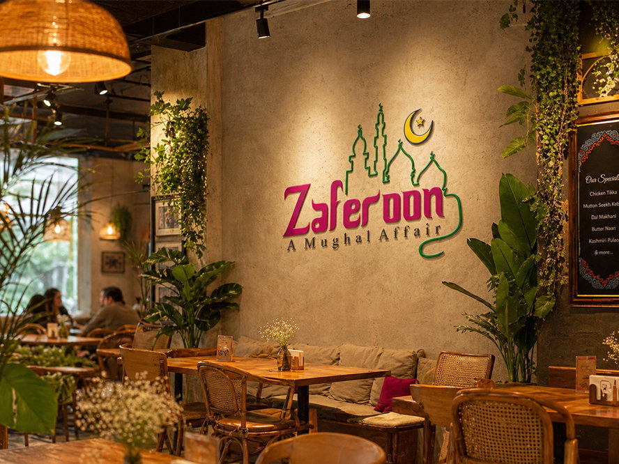
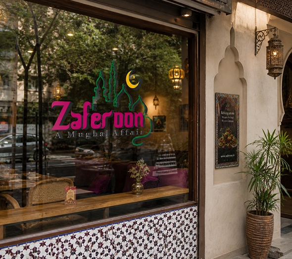
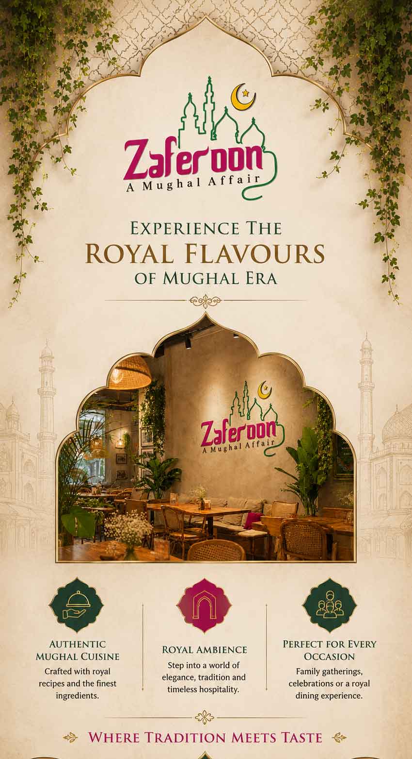
A logo that could live on a biryani box, a storefront in Lucknow, and an Instagram grid — simultaneously regal and instantly recognisable.
The Zaferoon logo was constructed around the Mughal arch — the mehrab shape that defines the architecture of India's most magnificent monuments. Inside the arch, a stylised minaret skyline rises against a crescent moon and star — imagery instantly legible to anyone familiar with Mughal India.
The wordmark "Zaferoon" in its distinctive script introduces a calligraphic flourish — bridging modern readability with the handwritten tradition of Urdu poetry. The hot magenta-pink brings irreverent energy and contemporary recall. The forest green grounds the icon in tradition.
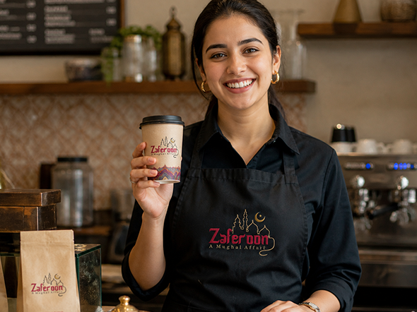
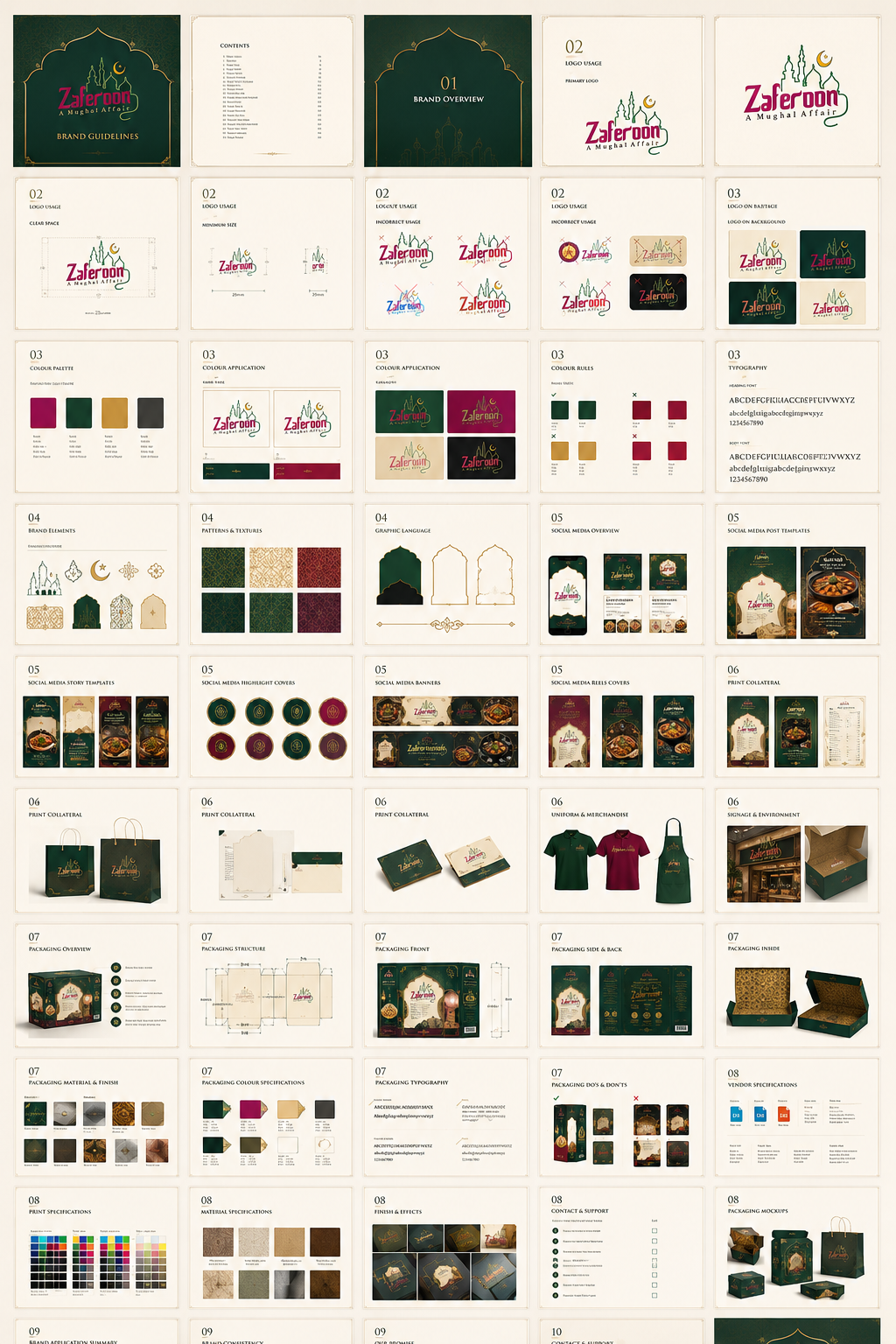
The complete logo system includes a primary lockup, standalone icon mark, horizontal variant, and a single-colour version — all specified for food packaging, digital interfaces, embossed menus, and signage.
THE CONSTITUTION
OF A CUISINE
A brand manual thick enough to run Zaferoon across Chandigarh, Lucknow, and anywhere else the aroma travels — with no creative confusion.
Seven brand colours defined with primary, secondary, and accent hierarchies. Each colour paired with its approved usage context — packaging surface, social background, print collateral, and digital UI — to prevent dilution of the brand palette.
Display headings in the Zaferoon script wordmark; editorial body in a curated serif that carries the warmth of Urdu calligraphy without sacrificing digital readability. Size scales, line-height tables, and language-specific (Hindi/Urdu/English) type guidance included.
The Mughal arch, floral jali patterns, and the crescent moon icon codified as a reusable motif system — scalable from box print to hoarding size, with clear rules for scale, spacing, colour application, and forbidden modifications.
Warm, generous, and slightly poetic. Zaferoon speaks like a gracious host — never a salesperson. Copy guidelines for menus, packaging, social captions, website pages, and customer communications written and exemplified in full.
Forty-page visual section showing correct and incorrect logo usage, colour applications, social media templates, and vendor-specification sheets for packaging printers — ensuring the brand looks identical whether printed in Chandigarh or Lucknow.
The Zaferoon delivery box became the brand's single most powerful marketing asset. Built on a cream parchment base with the Mughal arch as the centrepiece, surrounded by intricate floral patterns in crimson, indigo, and orange — the box looked less like takeaway and more like a gift from a palace kitchen.
The sides of the box were printed in the brand's signature hot magenta — giving it instant visual identity in any office pantry or delivery shelf. The phone number was large, clear, and placed prominently on every face. Every box was a billboard that travelled into homes, offices, and WhatsApp groups.
For the office-going professionals of Chandigarh's Industrial Area and UP's commercial hubs, the biryani-and-curd combo in a beautifully printed tiffin became a lunch ritual. The packaging made them feel like they were being served, not just fed.
It was the moment of the day — a biryani
that arrived like a letter from a Mughal court.
A MENU THAT
READS LIKE A
MANUSCRIPT
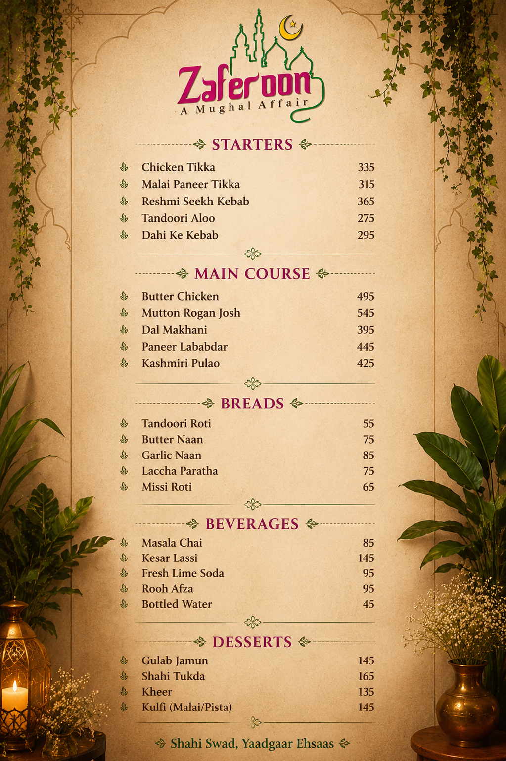
The Zaferoon menu was designed as a cultural artefact — not a price list. The front cover features the brand's full arch illustration against the Mughal floral pattern in crimson, purple, and gold. Every category — Kebabs, Shan-e-Tandoor, Naan/Roti, Rice, Curries — was typeset with a clarity that makes ordering feel considered, not chaotic.
The menu's design doubled as a flyer — printed back-to-back with the full menu on one side and the Zaferoon brand story, ordering information, and delivery platform logos (Zomato, Swiggy, Uber Eats, Foodpanda) on the other. A single piece of print that served both brand and operations.
ONLINE AS LAVISH
AS THE KITCHEN
A website and social presence built to translate the grandeur of the physical box into the digital realm — and drive orders around the clock.
The Zaferoon website was conceived as a full sensory encounter. The home page opens with the arch illustration at full bleed, the brand's magenta and gold flooding the screen. The menu section was structured to make ordering feel effortless — each dish described with the same warmth as the packaging, each category page reinforcing the Mughal heritage narrative.
Order-now buttons linked directly to Zomato, Swiggy, and Uber Eats — converting brand interest into immediate transactions. SEO architecture was built around high-intent local queries for Chandigarh and UP.
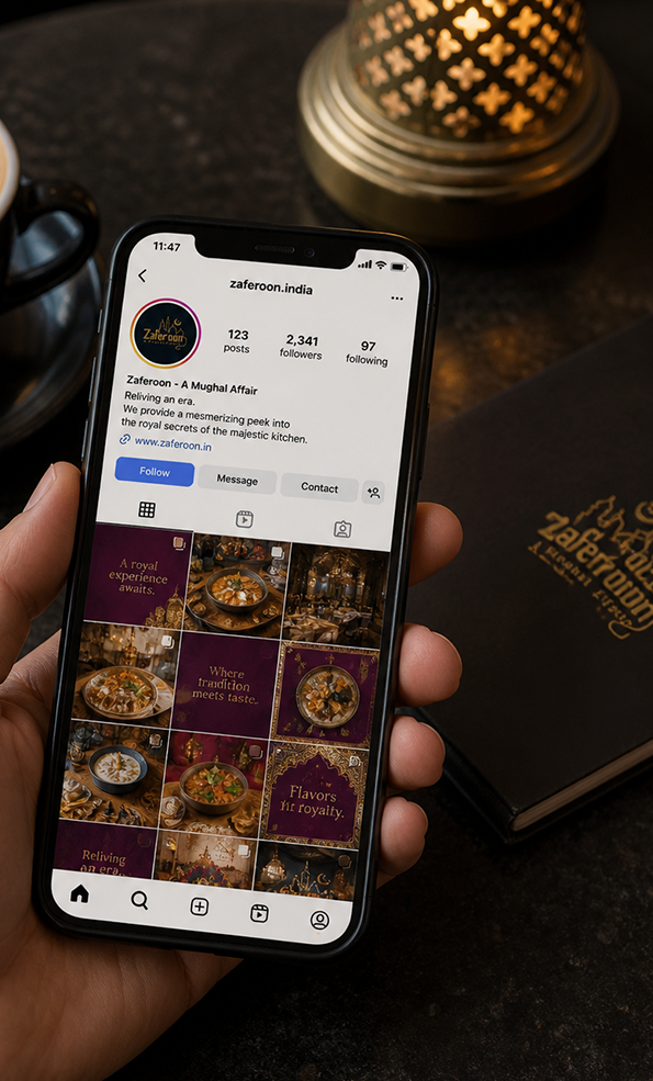
Three content pillars for Instagram and Facebook: Heritage — the Mughal stories behind each dish; Indulgence — close-up food photography designed to trigger immediate ordering; Community — customer photos with the unmistakeable pink boxes, turning every delivery into a user-generated ad.
HOW A TIFFIN BOX
WON THE CITY
No restaurant marketing campaign. No paid ads. Just a beautifully designed box, an extraordinary biryani, and an office crowd that wouldn't stop talking.
The office-going professionals of Chandigarh's Phase 1 and Phase 2 industrial areas became Zaferoon's most powerful distribution network. The lunch hour biryani-and-curd combo — priced accessibly, packed beautifully, and tasting genuinely Mughlai — created a word-of-mouth engine that no advertising budget could buy.
When the box landed on a desk, colleagues asked about it. When it was photographed and shared on WhatsApp, it became a recommendation. Zaferoon's packaging was so distinctive — so unlike any other delivery box in the market — that it functioned as a moving hoarding in every office, every car, every lift.
The expansion into Uttar Pradesh followed the same template. The brand's visual language translated perfectly across markets because it was built on a cultural truth that resonated from Chandigarh to Lucknow: Mughal food is a heritage, not just a cuisine. Zaferoon made that heritage feel personally delivered.
FROM ZERO TO
#1 EATERY
Identity
- Name coined, trademarked in Class 43
- Logo system with 4 variants delivered
- Complete brand manual — 50+ pages
- Colour, typography & motif system codified
- Tone of voice and copy guidelines written
Collateral
- Biryani tiffin box became viral delivery asset
- Menu-flyer designed and print-deployed
- Combo packaging drove repeat ordering
- Carry bags & sticker seals system designed
- Packaging photographed & shared organically
Online Presence
- Website zaferoon.in built and launched
- SEO for Chandigarh & UP keywords
- Listed & optimised on Zomato, Swiggy, UberEats
- Instagram & Facebook content engine active
- Word-of-mouth loop activated via packaging
Antraajaal didn't just design a logo. They gave our food a name it deserved, a face people remember, and a box that made every delivery feel like a celebration. Zaferoon is what it is because of the brand they built.
Build a Brand That
People Photograph
From naming and trademark to packaging that goes viral — Antraajaal builds restaurant and F&B brands that people talk about before they taste.