S.P. Singla
& Sons
Premium coffee table books and branded print material for one of India's most respected infrastructure and bridge-building companies — design that matches the permanence of the structures it celebrates.
A Company Whose Work
Stands for Generations
Some clients don't need to be introduced. S.P. Singla & Sons is a name that the infrastructure community across India knows — a company whose bridges carry millions of people safely across rivers, valleys, and highways that define the geography of the nation.
To work with a company of this stature is a responsibility that Antraajaal took seriously. The deliverables — coffee table books and corporate print material — were not routine commissions. They were publications intended to represent decades of engineering excellence, a portfolio of projects that changed the landscape of Indian infrastructure, and a corporate identity that belonged on the desks of ministers, commissioners, and industry leaders.
For a company that builds structures meant to last a hundred years, the brand collateral had to reflect that same quality of permanence. Every design decision — the paper stock, the typography, the photography direction, the binding, the layout proportions — was made with that standard in mind. When S.P. Singla hands someone a coffee table book, the book has to feel like the bridges it documents: substantial, precise, and built to last.
Infrastructure companies are judged by what they build. Their publications are judged by the same measure. Antraajaal's brief was to design material that matched the engineering quality of the projects inside it.
Publications Worthy of
What They Document
A coffee table book for an infrastructure company is not a brochure with extra pages. It is a permanent record of achievement — the kind of publication that sits in boardrooms, reception areas and ministerial offices for years, occasionally opened, always impressive.
Every Page Designed
to the Same Standard
as the Bridges
The design process for S.P. Singla's coffee table books began with a conversation about what the books were for — who would receive them, in what context, and what impression they needed to leave. The answer was unambiguous: these publications would be presented to government bodies, institutional clients, and industry peers. They had to be beyond reproach.
Photography Direction: Antraajaal worked closely with project photography to ensure the visual language was consistent — wide-angle engineering shots that communicated scale, detail photography that showed precision, and atmospheric shots at dawn, dusk, and during construction that gave the bridges a quality of drama and permanence. The photography was treated as the primary design element, with typography and layout built around it rather than competing with it.
Typography & Layout: Playfair Display for headings — a typeface with the gravitas of editorial tradition, readable at every size, authoritative without being cold. Clean body type in generous leading, giving every page the breathing room that communicates premium quality. Generous margins. The kind of white space that says the company behind this publication has nothing to prove and everything to celebrate.
Production Specification: Art paper with a soft matte finish that photographed beautifully and felt substantial in the hand. Spot UV on cover titles. Section divider pages in deep steel with amber foil accents. Ribbon bookmarks. Slipcase for presentation editions. Every production decision matched the quality of the content.
The best coffee table books are objects before they are publications. The reader should want to own one before they've opened the cover. Antraajaal designed the S.P. Singla books to pass that test.
Every Piece of Print
a Statement of Authority
Beyond the coffee table books, Antraajaal produced the full range of S.P. Singla's branded print collateral — each piece designed to the same standard of quality that the books established.
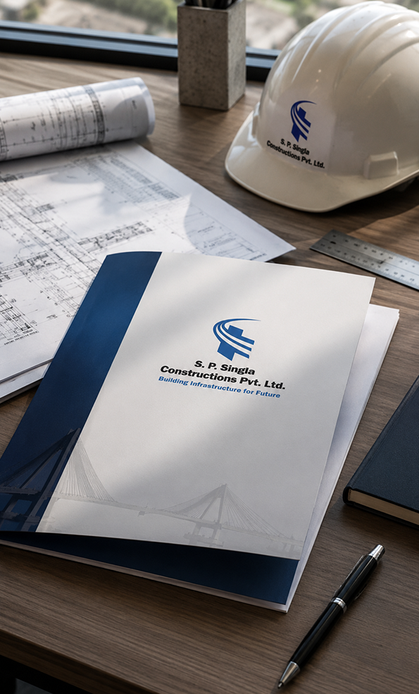
A premium corporate brochure for S.P. Singla — company history, engineering capabilities, project portfolio, certifications and vision. Designed for submission to government tendering bodies, institutional partners and large-scale project clients. Hard bound, foil-titled, built to travel in a briefcase and be left on a decision-maker's desk.
Sector-specific capability statements — bridge construction, highway infrastructure, railway overbridges — each tailored for the relevant audience with the appropriate technical vocabulary, project evidence and certification pages. Designed to answer the question a procurement officer asks before any other: "Have they done this before, and can I see the proof?"
Letterheads, envelopes, visiting cards, ID cards, and presentation folders — all designed in the established brand identity. The kind of stationery suite where every piece signals that the company behind it takes quality seriously at every scale, from a billion-rupee bridge tender to a correspondence letter.
Special commemorative print material for project completions, award ceremonies and industry recognitions — designed to mark significant milestones in the company's history with the gravitas those moments deserved. These pieces doubled as gifts for clients, partners and government stakeholders.
Large-format display panels, presentation boards and event-specific printed material for industry conferences, government forums and infrastructure exhibitions — presenting S.P. Singla's project portfolio at the scale the projects themselves demanded.
The Finish Is Part
of the Story
Infrastructure companies are judged by durability. Their publications should be too. Antraajaal's print specifications for the S.P. Singla coffee table books were chosen for longevity as much as aesthetics — paper stocks that would not yellow, bindings that would not crack, cover boards that would not warp.
Foil stamping on the cover titles in deep amber — the same colour as the brand's identity accent — gave the books a tactile quality that photographs cannot fully capture. Running your fingers across a foil-stamped title tells you everything you need to know about how seriously the company takes its own name.
Lay-flat binding for the double-page spreads — because a bridge photographed across two pages should never disappear into a gutter. Every spanning shot, every aerial panorama, every project timeline spread was treated as a single continuous image.
Slipcase presentation editions were produced for gifting — the kind of format that arrives in a meeting as a gesture and stays in an office as a permanent presence.
A coffee table book is handled, not just read. Every tactile detail — the weight of the paper, the resistance of the binding, the texture of the cover — communicates quality before a single word is seen. We designed all of it.
Publications as Permanent
as the Bridges They Celebrate
Publication Design
- Multiple volumes designed and produced
- Square lay-flat format — 300mm × 300mm
- Spot UV cover · amber foil stamp titles
- Section sewn binding — lay-flat spreads
- Slipcase presentation editions for gifting
Corporate Material
- Premium company profile brochure
- Sector capability documents — multiple versions
- Full stationery suite — all formats
- Exhibition and event display panels
- Award and milestone commemorative material
Identity & Authority
- Consistent visual language across all print
- Steel · amber · ivory palette established
- Every piece worthy of its audience
- Publications used at government and institutional level
- Print that carries the S.P. Singla name with dignity
We build bridges that carry the weight of the nation. Antraajaal built publications that carry the weight of everything we have achieved. When we place a coffee table book in front of a government client or a business partner, it says everything about who we are before we say a word.
— S.P. Singla & Sons | Infrastructure · Bridge Construction | Pan India