 Dr. Deepika Bahri
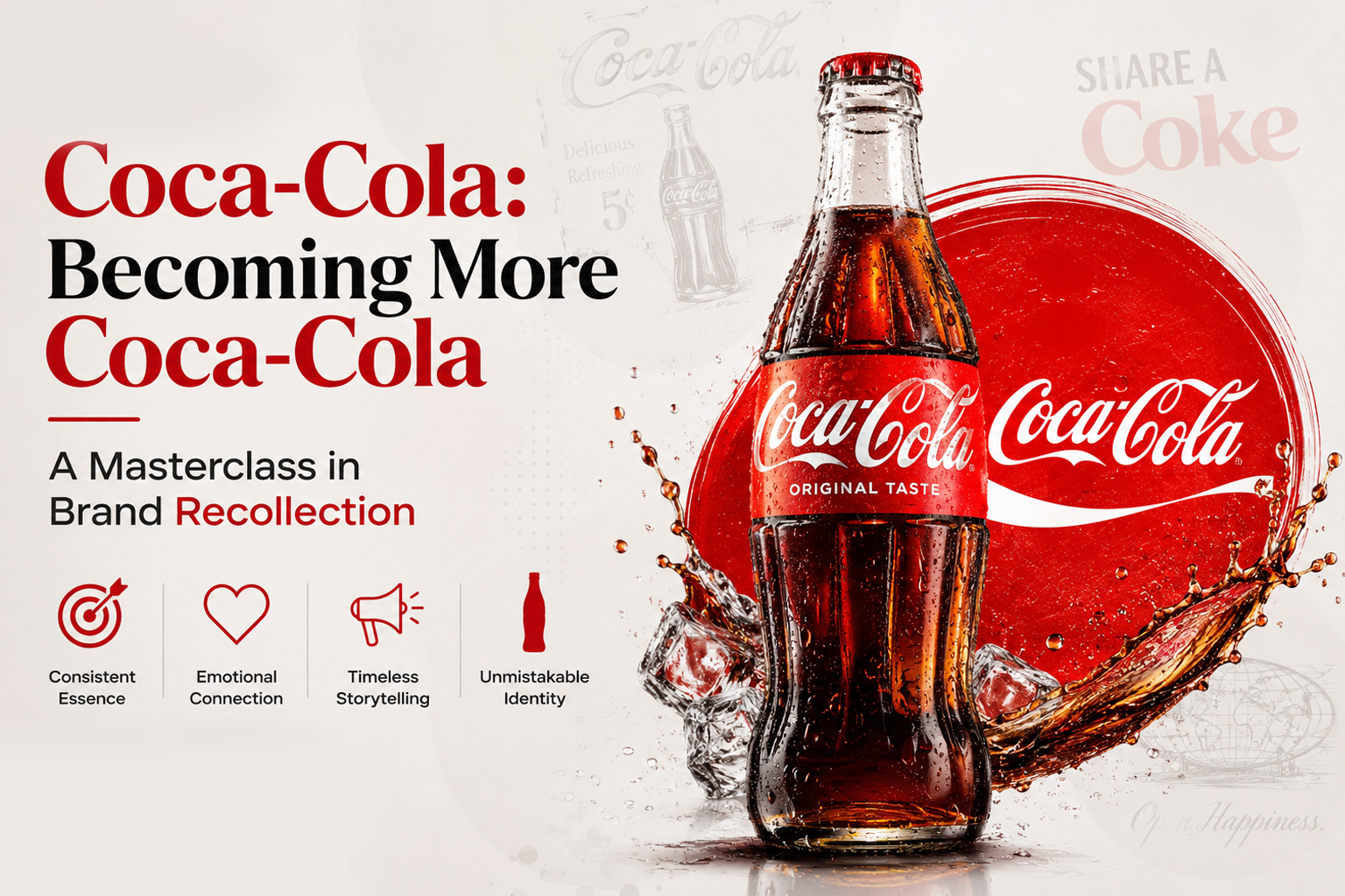
In a world where brands constantly chase trends, redesign logos, and experiment with new identities, Coca-Cola has chosen a remarkably different path. Instead of becoming something new, the world’s most iconic beverage brand has decided to become more Coca-Cola.
Its latest global branding refresh is not a rebranding—it is a reinforcement of everything consumers have loved and remembered for generations. It is a lesson in one of the most valuable principles of branding: the strongest brands don’t reinvent themselves; they strengthen the memories people already have of them.
At Antraajaal, we often tell our clients that branding isn’t about creating a logo. It’s about creating recognition, trust, and emotional connection. Coca-Cola’s latest identity perfectly demonstrates why.
Branding Isn’t Just Design—It’s Memory
Every successful brand occupies a space in the consumer’s mind.
When someone thinks of Coca-Cola, they don’t consciously recall every advertisement they’ve ever seen. Instead, they instantly visualize:
- The signature red.
- The flowing white script.
- The distinctive bottle silhouette.
- The Dynamic Ribbon.
- The feeling of celebration, happiness, and togetherness.
This instant mental association is known as brand recollection or brand recall, and it is one of the most valuable business assets a company can own.
Consumers rarely purchase based solely on logic. They purchase what they remember.
The New Coca-Cola Identity: More Recognition, Less Reinvention
The latest Coca-Cola visual identity doesn’t attempt to surprise consumers.
Instead, it amplifies the brand’s most recognizable assets:
- The iconic Spencerian script becomes more prominent.
- The Dynamic Ribbon regains visual importance.
- Packaging becomes cleaner and more confident.
- Colours become richer and bolder.
- Every touchpoint—from cans to vending machines—follows one unified design language.
This approach makes the brand easier to recognize from a distance, on digital screens, and on crowded retail shelves.
Rather than asking consumers to learn something new, Coca-Cola reminds them of something they have known for decades.
The Power of Colour in Branding
Very few brands own a colour the way Coca-Cola owns red.
Over decades of consistent use, red has become more than just a visual choice—it has become a business asset.
The human brain processes colour much faster than text. Before consumers read a brand name, they often recognize its colour palette.
Imagine these colours:
- Tiffany Blue
- Cadbury Purple
- Starbucks Green
- Coca-Cola Red
Most people immediately know the brand without reading a single word.
That is the power of colour consistency.
Every time a business changes its colours without strategic thinking, it weakens years of accumulated brand memory.
Logos Are Recognition Devices, Not Art Projects
Many businesses treat logos as creative exercises.
Great brands treat logos as recognition devices.
A logo does not have to be complicated.
It needs to be memorable.
The Coca-Cola script has remained largely unchanged for more than a century because it already performs its job exceptionally well.
Consumers don’t need a better logo.
They need to recognize it instantly.
This is why Coca-Cola chose to strengthen its existing identity instead of redesigning it completely.
Brand Assets Create Competitive Advantage
Marketing researchers often refer to distinctive brand assets as the visual and sensory elements that consumers uniquely associate with a brand.
For Coca-Cola, these include:
- The Spencerian logo
- Coca-Cola Red
- The Dynamic Ribbon
- The contour bottle
- White typography on a bold red background
These assets reduce the effort required for consumers to identify the product.
In a supermarket where hundreds of beverages compete for attention, recognition happens in seconds.
Strong branding shortens the decision-making process.
Consistency Builds Trust
One of the biggest mistakes businesses make is changing their branding too frequently.
A new logo every few years.
Different colours across social media.
Inconsistent typography.
Multiple visual styles across marketing materials.
Each inconsistency forces customers to relearn the brand.
Coca-Cola demonstrates the opposite philosophy.
Every campaign may evolve, but the core identity remains unmistakably Coca-Cola.
Consistency creates familiarity.
Familiarity creates trust.
Trust creates preference.
Brand Recollection Is More Valuable Than Brand Visibility
Many companies focus on being seen.
Great brands focus on being remembered.
Advertising can buy attention.
Branding earns memory.
When consumers enter a store, they often choose products they recognize before evaluating alternatives.
That recognition is the result of years of consistent branding—not a single advertisement.
This is why Coca-Cola invests as much in protecting its visual identity as it does in promoting its products.
What Businesses Can Learn
Whether you’re a startup, an established company, or a growing local business, Coca-Cola’s latest branding refresh offers valuable lessons:
- Build a brand people can recognize instantly.
- Choose colours strategically—and stay consistent.
- Treat your logo as a long-term business asset.
- Develop distinctive visual elements beyond the logo.
- Don’t redesign simply because trends change.
- Reinforce what customers already remember.
- Build emotional familiarity before chasing novelty.
The strongest brands don’t compete on products alone.
They compete on memory.
The Antraajaal Perspective
At Antraajaal, we believe branding is the foundation of every successful business.
A logo is only one part of a much larger identity.
True branding combines strategy, visual consistency, storytelling, customer experience, and emotional recall to create lasting impressions.
Coca-Cola’s latest global refresh reminds us that effective branding is not about constant change.
It is about strengthening the associations that already exist in the minds of consumers.
Because when customers remember your brand before they need your product, you’ve already won half the battle.
Final Thought
Coca-Cola’s new identity isn’t trying to become different.
It’s becoming more recognisable, more memorable, and ultimately, more Coca-Cola.
For businesses of every size, that’s the real lesson: the most powerful brands aren’t those that constantly reinvent themselves—they’re the ones that consistently reinforce who they already are.

Written by
Dr. Deepika Bahri
Dr. Deepika Bahri is a passionate Branding and Digital Marketing expert with a Doctorate in Marketing, specializing in Brand Strategy and Digital Transformation. With over Two Decades of experience in the media, advertising, and communication industry, she brings a unique blend of academic insight and real-world business acumen. She has also been honored with an Honorary Doctorate for her contribution to Women Empowerment, recognizing her efforts in mentoring, uplifting, and creating platforms for women-led enterprises. Currently serving as the CEO of Antraajaal, a leading branding and advertising agency, Dr. Bahri is committed to sharing insights on branding, marketing strategy, women leadership, and digital growth through her writing and speaking engagements.
Need Expert Guidance?
Antraajaal builds purpose-led brand identities for serious businesses.
Brand strategy, identity and digital presence — one integrated system, built to lead across North India.
Our Services