 Dr. Deepika Bahri
Roohi was five the first time she taught me something about design.
We were standing in the cereal aisle, the two of us, while her mother hunted for something with less sugar and more fibre. Roohi was too short to reach the good shelves and too impatient to be bored, so she started pointing at the boxes and sorting them, the way children sort everything — into boys and girls.
“That one’s a girl,” she said, pointing at a swirl of pink script.
“That one’s a boy.” A blocky, muscular logo, all sharp corners and shout.
“That one’s… a girl too, but shy.”
She couldn’t read most of the words yet. She had no idea what a serif was, or letter-spacing, or stroke contrast. She wasn’t reading the language at all. She was reading something underneath it — something the rest of us spend years in design school learning to name, and which she already knew in her bones.
And here’s the uncomfortable, fascinating truth she stumbled onto in that aisle: a logo can feel feminine or masculine long before anyone can explain why.
The feeling comes first. The reasons come later.
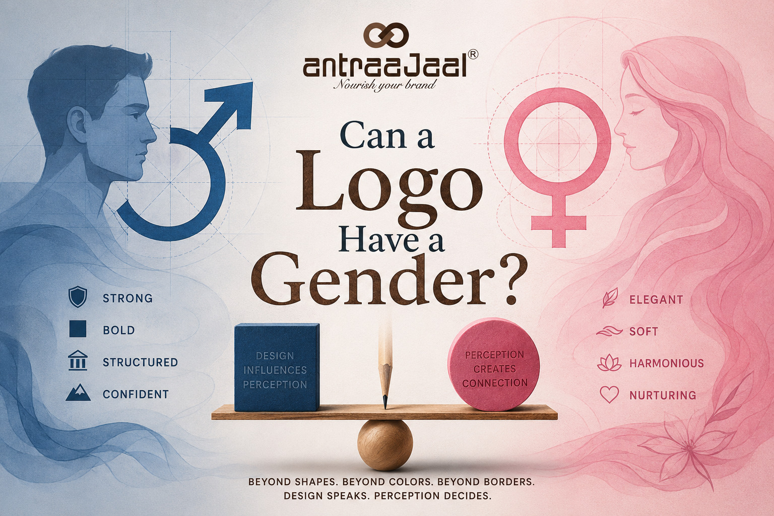
When we say a logo feels “feminine,” we’re almost never talking about anything a logo literally is. We’re talking about a bundle of qualities that culture, over a very long time, quietly taught us to read a certain way.
Soft, rounded letterforms feel gentle. Sharp angles and heavy weights feel strong. Thin, high-contrast strokes — the kind you see in fashion wordmarks — feel delicate and elegant. Flowing script feels intimate; rigid geometry feels controlled. Generous, breathing white space feels calm and open; tight, dense structure feels serious and dependable.
Somewhere along the way, we filed the first column under “her” and the second under “him.” Not because it’s true — but because we were told the story so many times we stopped noticing it was a story.
Roohi hadn’t been on the planet long enough to question it. She just felt it, cleanly, the way you feel warm and cold.
A walk past a few famous faces
Once you start looking, you can’t stop.
Barbie doesn’t whisper her gender — she announces it. That looping, exuberant pink script is femininity turned all the way up, unapologetic and glittering.
Harley-Davidson, by contrast, is a clenched fist. The bar-and-shield is heavy, angular, armoured. It doesn’t ask; it rumbles. You can practically smell the leather.
Chanel is more interesting. Two interlocking C’s, thin and perfectly symmetrical, cool as marble. It reads feminine — but it’s a restrained, powerful femininity, all discipline and no frills. Elegance that could cut you.
And then there are the logos that slip out of the boxes entirely. Coca-Cola’s Spencerian script has been flowing for over a century, and nobody thinks of it as a boy or a girl — they think of it as warm. Disney’s swooping cursive isn’t masculine or feminine; it’s childhood itself. Apple and Google work hard to feel like no one and everyone at once — smooth, friendly, deliberately neutral, designed to sit as comfortably in a boardroom as in a nursery.
That’s the part Roohi couldn’t see yet. Some logos lean into a gender. Some refuse one on purpose. And the good ones always know exactly which they’re doing.
The real skill isn’t the feeling. It’s the choosing.
Here’s where the branding actually lives.
Gender in design isn’t a switch — it’s a dial, and a whole spectrum sits between the two ends. The most interesting brands today don’t just pick “soft” or “strong.” They play in the middle, or they break the pattern on purpose.
A women’s brand that wants to signal power might throw out the pastel script and come out swinging in bold, uppercase, unbothered type — because sometimes the strongest thing a feminine brand can do is refuse to be delicate. A men’s wellness brand might do the opposite, softening its edges and its palette to say: it’s okay to be gentle with yourself. A logo built for everyone might carefully strip out every cue that leans one way, so that no one feels it wasn’t made for them.
None of this happens by accident. Every curve is a decision. Every hard corner is a decision.That is where thoughtful logo design begins—not with decoration, but with understanding the personality and perception a brand needs to create. When you understand that a rounded letter and a sharp one carry different emotional cargo, you stop designing on instinct and start designing on purpose. You’re not asking “does this look nice?” You’re asking “who does this make the viewer feel like, the moment they see it — and is that who we want them to be?”
That’s the whole game. A logo doesn’t have a gender. It has a personality. And personality is the thing we’re really designing — the character that walks into the room before a single word is spoken.
What Roohi knew
We never did find the low-sugar cereal. Her mother gave up and we left with something suspiciously pink, which Roohi had, of course, correctly identified as “a girl.”
But I’ve thought about that aisle many times since. Because a five-year-old, standing in front of a wall of brands, was doing effortlessly what an entire industry gets paid to do: she was feeling design. She read the curves and the corners and the colours and she came away with a whole personality — a gender, a mood, a shyness — before she could read a single letter.
That’s the thing about a great logo. It talks to the part of us that came before language. It reaches the five-year-old still sitting inside every grown-up customer, the one who decides in half a second whether something feels like her or him or me.
So — can a logo be feminine or masculine?
It can be whatever we design it to feel like. The only real question is whether we chose that feeling on purpose, or just let the old story choose it for us.
Roohi would tell you it’s obvious.
She’d be pointing at your logo right now, deciding.
Antraajaal builds brands with purpose—turning your logo, identity, and design into a feeling people recognise and remember.

Written by
Dr. Deepika Bahri
Dr. Deepika Bahri is a passionate Branding and Digital Marketing expert with a Doctorate in Marketing, specializing in Brand Strategy and Digital Transformation. With over Two Decades of experience in the media, advertising, and communication industry, she brings a unique blend of academic insight and real-world business acumen. She has also been honored with an Honorary Doctorate for her contribution to Women Empowerment, recognizing her efforts in mentoring, uplifting, and creating platforms for women-led enterprises. Currently serving as the CEO of Antraajaal, a leading branding and advertising agency, Dr. Bahri is committed to sharing insights on branding, marketing strategy, women leadership, and digital growth through her writing and speaking engagements.
Need Expert Guidance?
Antraajaal builds purpose-led brand identities for serious businesses.
Brand strategy, identity and digital presence — one integrated system, built to lead across North India.
Our Services