


Organzy
A skincare brand born from nothing — given a name, a trademark, a visual identity, a packaging system, a website, a social media voice, and the retail presence to make it real.
A Vision of Pure Skin,
Without a Brand to Hold It
Organzy was born from a belief that skincare should be as honest as the ingredients inside the bottle. The founders had formulas, convictions, and a dream — but not a single brand asset to their name.
The brand's founding ethos was clear: skincare rooted in organic ingredients, transparently sourced and thoughtfully formulated — for the modern Indian consumer who is increasingly aware of what she puts on her skin and equally aware of what she deserves as a customer. No greenwashing. No empty promises. Just product that works.
Antraajaal was engaged for the complete build — from the moment a name needed to be decided, to the day the first product sold on the website. Every layer of the brand — visual, verbal, physical, and digital — was Antraajaal's canvas.
There was no logo. No name finalized. No packaging system. No digital presence. Just a beautiful product and the conviction that it deserved to be seen. Antraajaal built everything else.
A Name That
Whispers Purity
Organzy. Clean, modern, and unmistakably rooted in what matters: organic, natural, responsible. The name carries the brand's promise in its very sound — the softness of "organ-" speaking to nature and the human body, the crispness of "-zy" giving it the energy of something contemporary and confident.
Antraajaal's naming process evaluated candidates across four dimensions: phonetic beauty in English and Hindi, memorability for the Indian digital consumer, search viability as a domain and handle, and trademark availability in skincare classes. Organzy cleared all four — and it was available. The trademark was filed and secured in Class 3 (cosmetics and skincare products) before a single product shipped.
A skincare brand's name is the first ingredient on the label. It must feel clean, trustworthy, and worth repeating — to a friend, in a search bar, on a shelf.
An Identity as Refined
as the Formula Inside
The Organzy logo was designed around the language of botanical luxury — the visual vocabulary of high-end skincare that communicates both scientific trust and natural warmth. A refined serif wordmark, precisely letterfit, carries a sense of quiet authority. The accompanying icon — a stylised bloom — was distilled from the same floral motifs that run throughout the brand's packaging and environmental design.
The palette of black velvet and antique gold was a deliberate positioning choice. In the Indian skincare market, most organic brands signal naturalness through earthy greens and browns. Organzy chose instead to signal premium — communicating that organic can be luxurious, not just wholesome.
The identity system includes primary and secondary logo lockups, a standalone botanical icon, a monogram, and a suite of ornamental elements — floral borders, line dividers, and seal marks — that give every brand touchpoint its own decorative elegance.
Black and gold don't say "natural." They say "this natural brand is worth premium attention." That repositioning was worth more than any formula claim on the packaging.
Packaging That Earns
Its Place on the Shelf
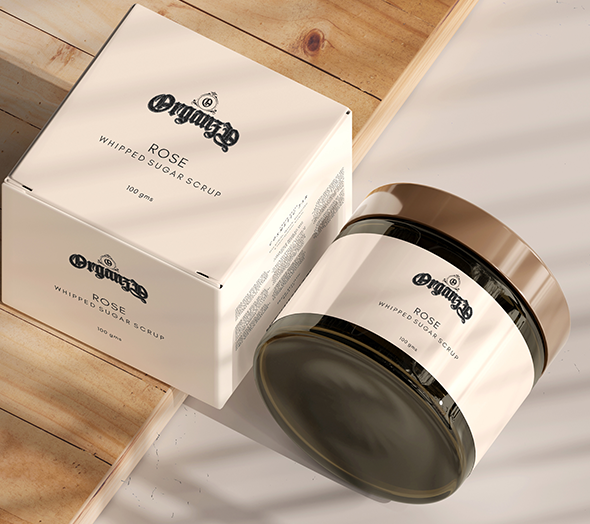
In skincare, the bottle is the brand. Every product in the Organzy range was designed to hold its own alongside international premium labels — and to tell its organic story without apologising for being beautiful.
The Organzy packaging system was built around a single visual language: black as the primary canvas — commanding, premium, modern — with antique gold for the wordmark, botanical illustrations, and ornamental borders. The floral outlines that run across the packaging are hand-refined line drawings of the brand's hero ingredients: chamomile, rose, aloe, and neem — rendered in gold hairlines that turn each bottle into a small work of art.
Every product in the range received its own label system — consistent in the base language, differentiated by a unique botanical illustration and a subtle secondary colour band that allows customers to distinguish product types at a glance without disrupting the premium visual coherence of the range.
The outer box packaging continued the language — debossed wordmark on matte black board, gold foil accents, tissue-lined interior. Not because it was necessary, but because the unboxing experience is content. And Organzy's customers were already sharing their orders before they'd finished unwrapping.
A skincare customer doesn't just buy a product — she buys the ritual of using it. The packaging is the first moment of that ritual. It must feel like it belongs in a dressing room she aspires to.
A Space That Feels
Like the Product
Organzy's physical retail and pop-up spaces were designed as extensions of the packaging language — black walls, gold lettering, botanical line illustrations applied as wall murals and shelf headers. The design philosophy was deliberate: a customer standing in an Organzy space should feel the same way she feels when she holds one of the bottles. Elevated. Considered. Cared for.
The retail branding system covers display counter wraps, shelf talkers, free-standing display units, and wall graphics — all designed to be deployed in third-party retail environments without losing brand integrity. The modular system means Organzy looks like Organzy whether it's a corner of a beauty store or a full pop-up event.
Counter wraps, unit headers, and price tag templates all within the black-gold-white system. Products displayed as a range, not as individual SKUs.
Large-format botanical line illustrations — the brand's signature floral motifs enlarged for wall application. Gold on black or gold on white, depending on the space.
Gift wrapping system, message cards, and in-store promotional materials — all maintained within the brand identity for a seamless customer experience from shelf to home.
A Boutique That
Lives Online
organzy.in was built as a luxury D2C skincare destination — not a basic product catalogue. The site's design language mirrors the packaging: black canvas, gold accents, botanical illustrations as background elements, and generous white space that gives the products room to breathe.
The user journey was architected around conversion and trust. Homepage with hero product photography and brand story. Shop pages organised by skin concern (hydration, brightening, anti-ageing) rather than product type — meeting the customer at the language she uses. Product pages with ingredient storytelling, dermatologist notes, and review integration.
The website must make a first-time visitor feel educated, not sold to. She came to understand the brand — help her do that, and the purchase follows naturally.
Content That Converts
Scrollers Into Believers
Organzy's social media was built on three content pillars: Ingredient Transparency — educating the audience on what's in each formula and why it works, building the trust that converts a follower into a first-time buyer; Ritual & Aspiration — beautiful product photography and morning/evening routine content that positions Organzy as part of a lifestyle, not just a purchase; Community & Results — before-and-after stories, customer testimonials, and user-generated content that closes the credibility loop.
The visual identity on Instagram was strictly maintained — black and gold backgrounds, botanical overlays, consistent typography. The Organzy grid became a portfolio of the brand's luxury positioning, every post a reason to trust the next product launch.
Skincare buyers research before they buy. Our content was built to be the research — so that by the time she clicked Add to Cart, Organzy already felt like the only logical choice.
The Numbers Behind
the Glow
It redefined what organic luxury looks like
when it's built from the ground up with intention.
A Skincare Brand
the Industry Noticed
Identity & Trademark
- Name coined and trademark filed — Class 3
- Logo system with 4 variants delivered
- Complete botanical identity language
- Brand manual — colour, type, illustration
- Black, gold & white as premium positioning
Packaging & Retail
- Full label system — botanical gold-on-black
- Outer box with foil deboss and tissue lining
- Gift set box — rigid + magnetic + ribbon
- Carry bag, sachet and thank-you card
- Retail & pop-up indoor branding system
Sales & Community
- 5× revenue growth in Year 1
- 72% of sales from digital channels
- Instagram followers grew 380% in 6 months
- 4.9★ average across all platforms
- SEO ranking for key skincare search terms
Antraajaal didn't just design a logo — they built a world for Organzy to live in. The packaging, the website, the Instagram, the way it looks in a store — it all feels like one beautiful, intentional thing. Our customers feel the difference before they've opened a single product.
— Founder, Organzy | organzy.inMore Brands We've
Built from Zero
Motiwala