Anuja
Healthcare
A pharmaceutical company that needed more than a logo — it needed a complete brand system capable of carrying 50+ distinct products, with every box, every LBL, every brochure communicating the same trust, precision and care. Antraajaal delivered the whole system.
Fifty Products.
One Brand.
Zero Compromise.
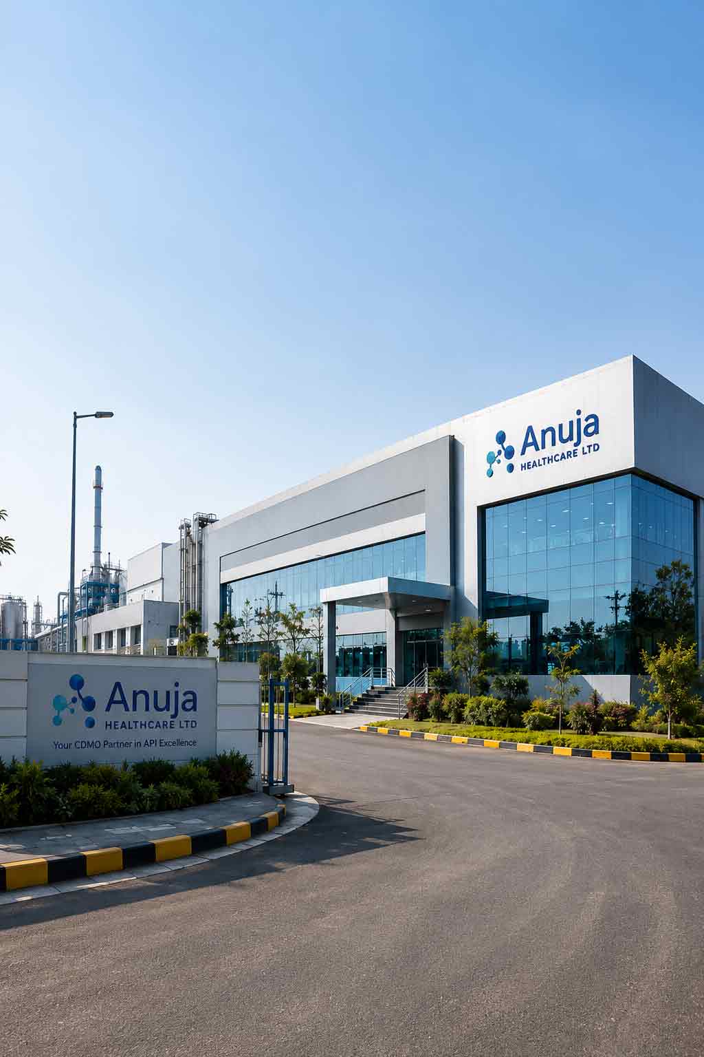
When Anuja Healthcare came to Antraajaal, the brief was one of the most comprehensive in the agency's history — not a single product, not a small range, but an entire pharmaceutical company that needed its complete visual world built from the ground up. Fifty-plus products. Every box. Every label. Every LBL. The full corporate brochure. All of it consistent. All of it compliant. All of it communicating the quality that healthcare professionals and patients deserve to see.
Pharmaceutical packaging operates within a set of constraints that no other design category faces. Regulatory compliance requirements mean certain information must be present, in certain type sizes, in certain positions. Drug schedules, batch numbers, manufacturing dates, storage conditions, composition details — the mandatory elements are non-negotiable. The designer's job is to make all of it clear, correct, and still beautiful. To make the brand visible within the compliance, not despite it.
Antraajaal's approach to Anuja Healthcare's visual system began with a fundamental decision — to build a master brand architecture capable of carrying any number of products without losing coherence. The colour, the grid, the typography, the hierarchy of information — all established at the system level first, so that every individual product decision reinforced the whole rather than fragmenting it.
50+ individual products means 50+ unique packaging designs, 50+ individual LBLs, and a brand system strong enough that a doctor or patient picking up any one of them immediately knows it's Anuja Healthcare — before they've read a word.
A Brand System
That Could Carry
Any Product Forward.
The Anuja Healthcare brand was built around three interlocking visual values: Trust (deep navy — the colour of medical authority), Care (clinical teal — the colour of healthcare environments and therapeutic precision) and Life (health green — the colour of growth, recovery and wellness). Three colours that, together, told the brand's full story before a product name was read.
The Anuja Healthcare logo mark — an A-cross combination — embedded the medical cross (universally recognised symbol of healthcare) directly into the brand's first letter, making the category legible at a glance and the brand distinctive within it. The letterforms were chosen for their clean, modern authority: healthcare that was professional and contemporary, not institutional and cold.
Typography was selected for regulatory utility as well as brand expression — typefaces that could carry small mandatory text clearly and legibly while maintaining brand character at larger display sizes. A constraint that most brand projects don't face, and one that shaped every typographic decision in the system.
A pharmaceutical brand system must be modular — each product needs individual identity, but every product must belong unmistakably to the parent brand. Antraajaal built the grid, the colour application rules and the typography hierarchy so that both were true for all 50+ products simultaneously.
Every Box a
Patient Picks Up.
Every One Perfect.
Fifty products is not fifty versions of the same design — it is fifty distinct communication problems that all need to be solved within the same brand language. Different drug classes, different dosage forms, different pack sizes, different consumer profiles, different regulatory schedules. Each one designed individually. Each one belonging to the system.
Before a single product was designed, Antraajaal established the master packaging grid — the proportional system that determined where every element sat on every pack. Brand zone, product name zone, composition zone, regulatory information zone, mandatory text zone. A grid that accommodated blister packs, strip packs, bottles, tubes and sachets — every format — while keeping the visual identity coherent across all of them.
Within the navy-teal-green brand system, product categories were given colour treatment sub-systems — antibiotics, analgesics, nutraceuticals, gastrointestinals, vitamins and minerals each given a colour accent that distinguished the category at a glance without departing from the brand palette. A doctor reaching for the right product category found it faster. A patient recognising their regular medicine found it immediately.
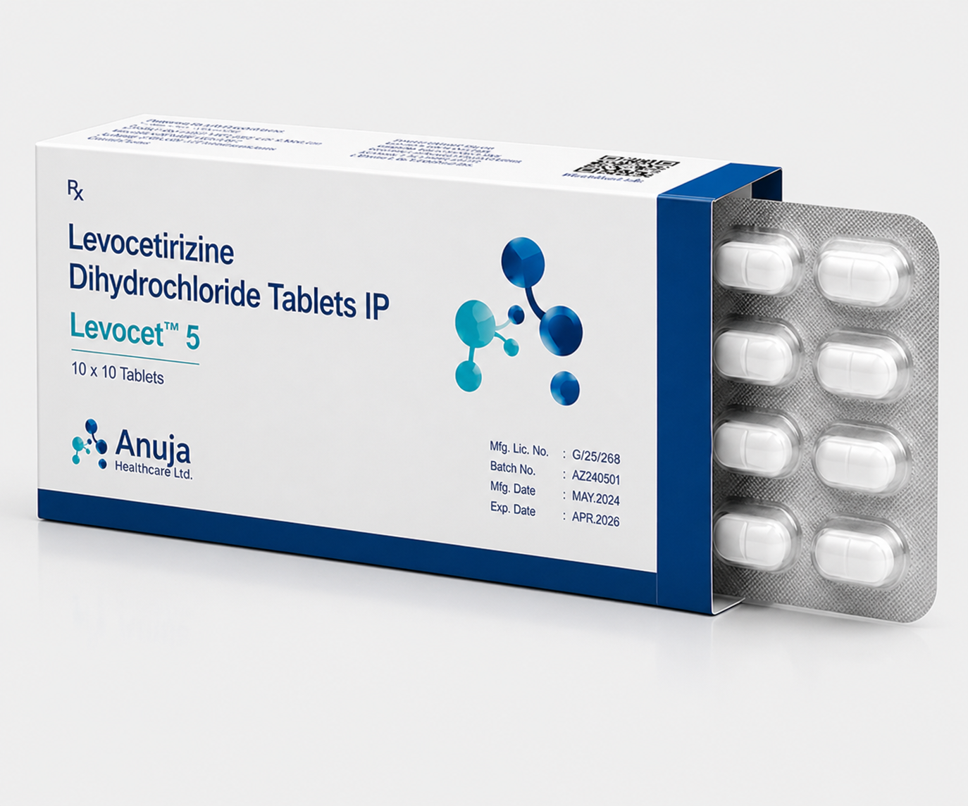
Every pack designed with Schedule H / Schedule H1 / OTC status clearly indicated, batch number and expiry date fields precisely positioned, storage condition icons standardised across all products, government drug licence numbers accurately placed, and MRP/net weight clearly visible. Compliance was not an afterthought added to the design — it was designed in from the beginning, so that mandatory elements and brand elements occupied the pack in harmony.
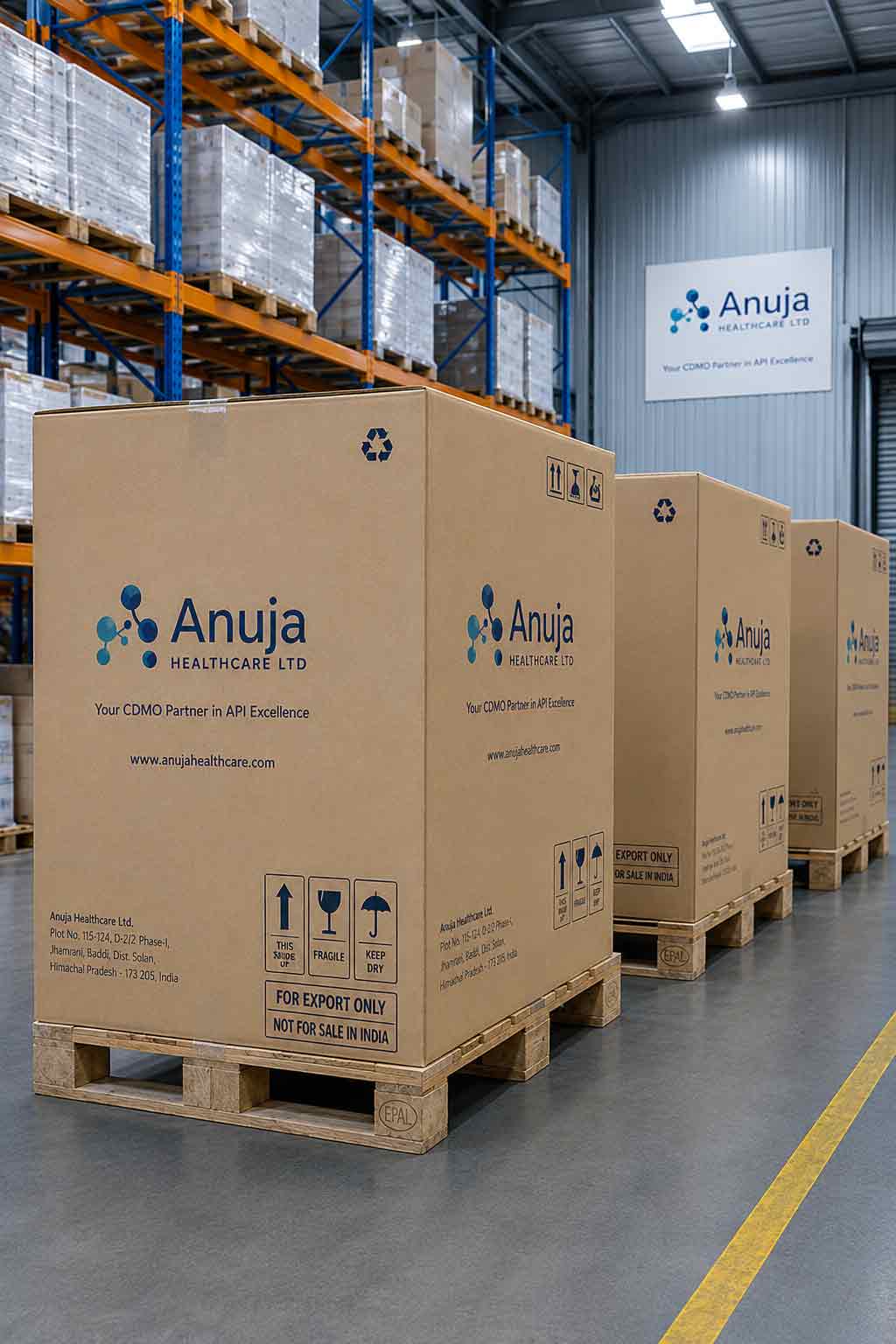
Every packaging design delivered as production-ready print artwork — correct colour profiles (CMYK for offset, Pantone calls for where required), bleed and safe zone marks applied, all fonts outlined, all images embedded at 300 DPI. Artwork files that went directly to the printing press without needing further preparation. 50+ files, every one production-ready.
The Leaflet Inside
Every Box. Designed
as Carefully as the Box.
The LBL — the printed leaflet folded inside every pharmaceutical pack — is the most information-dense document a patient ever reads. Composition, indications, contraindications, dosage, interactions, storage, manufacturer details. Regulatory mandates determine what must be present. Design determines whether it is readable, trustworthy, and helpful. Antraajaal designed all 50+ LBLs to meet both standards.
Information Architecture: Each LBL begins with its content hierarchy — the sequence in which a patient or healthcare professional needs to encounter information. Product name and composition first. Indications. Dosage and administration. Contraindications. Side effects. Drug interactions. Storage. Manufacturer details. The same architecture across all 50+ LBLs, so that a doctor who reads one Anuja Healthcare LBL knows immediately how to navigate all of them.
Typography for Readability: LBLs are read in difficult conditions — small text, bad lighting, patients who may not be feeling well. Antraajaal selected typefaces and type sizes that maximised readability at small scales: open apertures, generous line spacing, clear heading-to-body weight contrast, and adequate white space between sections to allow the eye to navigate. Compliant with regulatory minimum type size requirements while being as readable as possible within those constraints.
Bilingual and Multilingual Layouts: Where regulatory requirements necessitated multiple languages, the LBL layout was engineered to accommodate the additional text without compromising the information hierarchy or visual clarity. Column systems, language-coded sections and typographic weight differentiation allowed multiple language versions to coexist legibly on a single unfolded sheet.
A patient who reads their LBL clearly is a patient who takes their medicine correctly. Good LBL design is patient safety design. Antraajaal treated every one of Anuja Healthcare's 50+ LBLs with that responsibility at the centre of every decision.
The Document That
Opened Doors with
Doctors & Distributors.
The Anuja Healthcare corporate brochure was the brand's primary B2B marketing tool — the document that a medical representative placed in a doctor's hands, that a distributor received at a trade meeting, that a stockist reviewed before placing their first order. It had to communicate, clearly and completely, why Anuja Healthcare was a pharmaceutical partner worth trusting.
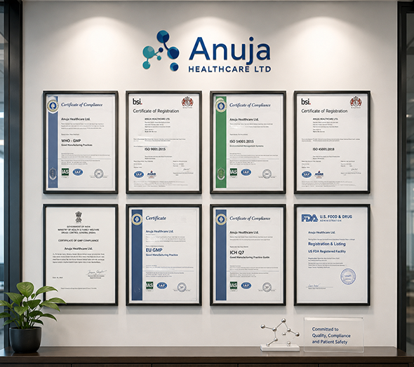
Corporate Story: A founder's message that established the company's values, philosophy and commitment to quality. Manufacturing facility credentials, quality assurance certifications, GMP compliance documentation — all presented with the design quality that told the reader these were not box-ticking claims but genuine operating standards.
Product Range Showcase: The full 50+ product range organised by therapeutic category — each category given its branded colour treatment, each product listing clear on active ingredients, available strengths, pack sizes and indications. A comprehensive reference that a doctor could consult and a distributor could order from in the same document.
Print Production: Designed for premium offset printing — gloss laminated cover, matte interior pages, spot UV on brand mark, and the binding quality that a corporate brochure left in a hospital pharmacy or doctor's consulting room needed to survive regular handling.
In pharma B2B, the brochure is the brand's first credibility test. A well-designed brochure in a doctor's hands says: this company is serious. Antraajaal built a brochure that passed that test on every page.
The Most
Comprehensive
Pharma Brief We've Done.
The Full
Anuja Healthcare
Project


A Complete Pharmaceutical
Brand. Built to Last.
Identity at Scale
- Complete Anuja Healthcare brand identity
- Navy-teal-green palette — trust, care, life
- A-cross logo mark — medical + brand unified
- Master packaging grid — all formats covered
- Brand guidelines for all future applications
Every Product Covered
- 50+ individual product pack designs
- Category colour coding system applied
- Regulatory compliance built into every design
- All formats — strips, blisters, bottles, sachets
- Print-ready artwork — all 50+ files delivered
Leaflet to Brochure
- 50+ LBLs — all products individually designed
- Information architecture standardised across range
- Bilingual layouts where required
- Corporate brochure — B2B ready, print-ready
- Product literature for medical representatives
We came to Antraajaal with 50 products that needed to look like one brand. They built us a system — every pack, every LBL, every page of the brochure — that made Anuja Healthcare look like a company that had been operating with this standard of quality for decades, not just since the day the new packaging came off the press.
— Anuja Healthcare | Pharmaceutical Brand | India