 Dr. Deepika Bahri
The secret messages hiding in famous logos — and why the best ones aren’t showing off.
I once ruined a perfectly good dinner with four words.
We were crowded around a table, chai going cold, someone’s phone lighting up with a delivery notification. I picked it up, turned it around, and said: “Look at the FedEx.”
Blank faces.
“There’s an arrow in it. Between the ‘E’ and the ‘x’. In the white space.”
A pause. Then the squinting. Then — one by one, like a row of lights switching on — the gasps. For the next ten minutes nobody spoke about anything else. Phones came out. Someone found the Amazon smile. Someone else genuinely accused me of ruining logos for them forever.
And they were right. Because that’s the strange magic of a hidden mark: once you see it, you can’t un-see it. It becomes yours. It follows you down the street and onto the side of every delivery van for the rest of your life.
The gift you were never told about
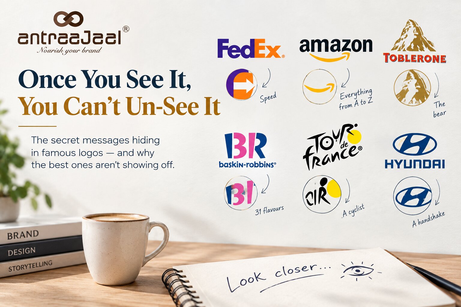
The arrow in FedEx isn’t a happy accident. It was placed there, deliberately and beautifully, in the negative space where the ‘E’ and the ‘x’ almost touch. It says everything the company wants to say — speed, precision, forward motion — and it says it without a single word. You’ve looked at that logo a thousand times. It was hiding in plain sight, every single time, waiting for you.
This is what separates real logo design from decoration: the idea arrives before the drawing does.
Once you start looking, they’re everywhere.
That little swoosh under Amazon isn’t just a smile. Follow it: it runs from the ‘a’ to the ‘z’. Everything, from A to Z, delivered with a grin. Two ideas in one soft yellow curve.
Toblerone shows you a mountain — the Matterhorn, the Swiss Alps, obvious and proud. What it doesn’t announce is the bear standing upright inside that mountain, tucked into the shadows of the rock. It’s a quiet bow to Bern, the chocolate’s home city, known for centuries as the City of Bears. Heritage, folded into a snack you’ve eaten a hundred times without noticing.
The playful pink inside the Baskin-Robbins ‘B’ and ‘R’? Look again. It’s a number: 31. One flavour for every day of the month — the brand’s original promise, baked right into its name.
The Tour de France wordmark looks, at a glance, like a jaunty typeface. Then the ‘R’ in “Tour” resolves into a cyclist hunched over the handlebars, and the bright yellow circle beside it becomes both his spinning wheel and the blazing summer sun. A whole race, hidden in a single word.
Even Hyundai’s slanted ‘H’ isn’t just an ‘H’. It’s two figures — a satisfied customer and a company representative — shaking hands.
Why the trick has to mean something
Here’s the part that matters, and it’s the part most people miss.
None of these are decoration for decoration’s sake. They aren’t clever for the sake of clever. Look at what each secret actually says: FedEx hides speed. Amazon hides everything. Toblerone hides where it comes from. Baskin-Robbins hides its variety. Tour de France hides the race itself. Hyundai hides a handshake.
Every single one whispers something that’s genuinely true about the brand. That’s the line between a gimmick and a masterstroke — a gimmick is a secret that means nothing, and a masterstroke is a secret that means everything. Anyone can hide a shape in a logo. The art is hiding the right one.
And there’s a discipline underneath it that’s easy to overlook. The secret can never come at the cost of the obvious. FedEx reads as “FedEx” instantly — at any size, on the back of a truck doing a hundred on the motorway. The arrow is a reward for looking closer, never a riddle you’re forced to solve before you understand the thing. The front door stays wide open; the secret just waits in a back room for whoever’s curious enough to wander in.
The real reason it works
A hidden mark does something a printed slogan never can.
When a brand tells you “we sell everything from A to Z,” you nod politely and forget it by lunch. But when you spot that A-to-Z arrow yourself — when you’re the one who leans in and goes “oh!” — something completely different happens. You feel let in on a secret. You feel clever. And then you do the one thing every brand on earth is desperate for you to do: you turn to the person next to you and show them.
In that moment, the brand has quietly recruited you as its storyteller. And it managed it not by shouting, but by trusting you — by assuming you were sharp enough to notice, and generous enough to pass it on.
That’s the whole philosophy in a sentence. Great design doesn’t talk down to people. It leaves a small gift and trusts them to find it. It flatters the viewer’s intelligence instead of insulting it.
Back at the table
My friends forgave me, eventually.
But not one of them, to this day, can watch a FedEx van go by without their eyes darting straight to that little white arrow. They didn’t ask for that. I gave it to them over cold chai, and now it’s theirs for good.
That isn’t annoyance. That’s a brand living rent-free in someone’s attention — which, when you get right down to it, is the only real estate that has ever mattered.
Design that rewards a second look earns a second look. And a third. And, if you do it right, a lifetime of them.
Good logo design is patient like that — and at Antraajaal, patience is the point.

Written by
Dr. Deepika Bahri
Dr. Deepika Bahri is a passionate Branding and Digital Marketing expert with a Doctorate in Marketing, specializing in Brand Strategy and Digital Transformation. With over Two Decades of experience in the media, advertising, and communication industry, she brings a unique blend of academic insight and real-world business acumen. She has also been honored with an Honorary Doctorate for her contribution to Women Empowerment, recognizing her efforts in mentoring, uplifting, and creating platforms for women-led enterprises. Currently serving as the CEO of Antraajaal, a leading branding and advertising agency, Dr. Bahri is committed to sharing insights on branding, marketing strategy, women leadership, and digital growth through her writing and speaking engagements.
Need Expert Guidance?
Antraajaal builds purpose-led brand identities for serious businesses.
Brand strategy, identity and digital presence — one integrated system, built to lead across North India.
Our Services