 Dr. Deepika Bahri
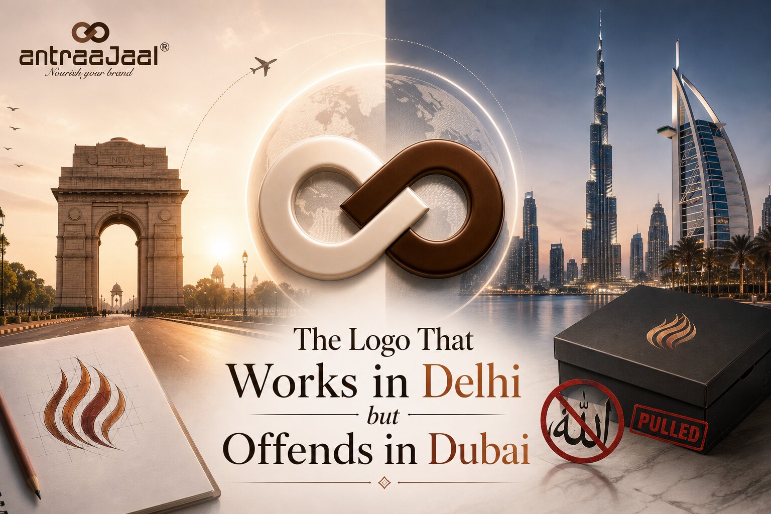
Why a mark that earns applause in one city can be an insult a short flight away — and what that teaches anyone building a brand for the world.
Picture a single logo. A clean, modern mark — a warm curl of colour, a little flourish that flickers like a flame or a ribbon.
In one city, it launches to applause. The client loves it, the press likes it, it looks perfect on the storefront.
A short flight away, the very same mark has to be pulled from shelves within days.
Nothing about the logo changed. Everything about the eyes looking at it did.
That gap — between “beautiful” here and “offensive” there — is the single most expensive blind spot in branding. And the brands that fall into it are almost never careless. They’re usually the biggest, best-resourced companies on earth.
The most famous version of this story
In 1997, Nike released a basketball shoe with a stylised flame logo on the heel — part of a playful line with names like Air Bakin’ and Air B-Que. In an English-reading boardroom, it was exactly what it looked like: fire, heat, speed.
To many Muslims, that flame closely resembled the word Allah written in Arabic script. And it was printed on a shoe — an object that gets walked on, scuffed, and left in the dust. The name of God, underfoot. It’s hard to imagine a more painful accident of design.
The response was swift. Nike apologised, recalled tens of thousands of pairs, donated fifty thousand dollars toward an Islamic school, and agreed to sit down and learn. A costly lesson — and, remarkably, one the company brushed up against again two decades later, when another sole design drew the same objection.
Here’s the part worth sitting with: nobody at Nike set out to offend anyone. The designers saw flames. They simply weren’t looking through the eyes of the person who would see something sacred. That’s the whole trap in a sentence. It isn’t malice. It’s a failure of imagination about who’s on the other side of the design.
Meaning doesn’t travel. It’s local.
We like to believe good design is a universal language — that a beautiful mark is beautiful everywhere. It’s a comforting idea, and it’s wrong. Design isn’t a universal language. It’s a set of local dialects, and the same word means different things in each one.
Take colour, the thing every brand thinks is safe. In India, red is the colour of weddings — auspicious, joyful, the shade a bride wears. White, meanwhile, carries the weight of mourning; it’s the colour of loss, of the widow. Now carry those instincts to a different tradition, where white is the pure, celebratory colour of a wedding dress, and red might read as warning or passion. Same two colours. Opposite emotional cargo. A palette that says “celebration” in one market can quietly whisper “funeral” in another.
Or direction. Arabic reads right to left — which means a logo built around left-to-right motion, an arrow of progress, a “before and after,” a forward-leaning flourish, can literally reverse its meaning when the eye that reads it has been trained to travel the other way. The momentum you designed as “moving ahead” can land as “falling behind.” This is one reason thoughtful logo design has to consider not just how a mark looks, but how different audiences may read and interpret it.
Or symbols and gestures. The owl that signals wisdom in one culture is read as an omen of bad luck in another. A thumbs-up, a pointed sole, an offering made with the “wrong” hand — small, invisible-to-you choices that carry real weight to someone raised inside a different code. Green is simply a pleasant, natural colour in much of the world; in the Gulf it’s bound up with the sacred, and deserves to be handled with care, not splashed around as decoration.
None of these are strange rules to be memorised and feared. They’re simply meaning — the same way your own instincts about colour and shape are meaning, so deep you’ve forgotten they were ever learned.
The humility that global brands actually need
Here’s the counterintuitive thing. The answer to all of this is not to design blandly — to strip out every colour, symbol, and flourish until you’re left with a grey, offend-nobody nothing. A brand terrified of meaning has no meaning. That’s not safety; it’s surrender.
The answer is humility. It’s building the habit of asking, in every new city, one deceptively simple question before anything ships: what does this mean here? Not “do I like it” — you already know you like it. But: who is the person on the other side of this mark, what have they been taught to see, and what will this shape say to them, in their language, with their history?
That question costs almost nothing to ask, and everything to skip. It’s the difference between a brand that arrives in a new market like a guest — curious, respectful, listening — and one that arrives like a tourist who assumes everyone should just understand English.
Why this matters more than ever
This used to be a problem only for the Nikes of the world. It isn’t anymore. Right now, homegrown brands are crossing borders in every direction — Indian companies opening in the Gulf, in Southeast Asia, in Africa, in the West — carrying logos that were designed, quite naturally, for the eyes back home.
And a mark made in Delhi will, sooner or later, be seen in Dubai. In Jakarta. In Lagos. In London. The moment it leaves home, it stops being just your design and becomes a small ambassador, walking into rooms full of people who were raised to read the world differently than you were.
The best time to think about how it’ll be read there is not after the recall. It’s before the first sketch.
Because a logo doesn’t carry your intention. It carries whatever the person looking at it already believes. And the whole art of designing for the world is remembering, humbly, that they were never looking through your eyes.
They were always, only, looking through their own.
For Antraajaal, this is an important part of thinking about branding across markets: a strong identity has to be understood not only by the people who create it, but also by the people who encounter it.

Written by
Dr. Deepika Bahri
Dr. Deepika Bahri is a passionate Branding and Digital Marketing expert with a Doctorate in Marketing, specializing in Brand Strategy and Digital Transformation. With over Two Decades of experience in the media, advertising, and communication industry, she brings a unique blend of academic insight and real-world business acumen. She has also been honored with an Honorary Doctorate for her contribution to Women Empowerment, recognizing her efforts in mentoring, uplifting, and creating platforms for women-led enterprises. Currently serving as the CEO of Antraajaal, a leading branding and advertising agency, Dr. Bahri is committed to sharing insights on branding, marketing strategy, women leadership, and digital growth through her writing and speaking engagements.
Need Expert Guidance?
Antraajaal builds purpose-led brand identities for serious businesses.
Brand strategy, identity and digital presence — one integrated system, built to lead across North India.
Our Services