 Dr. Deepika Bahri
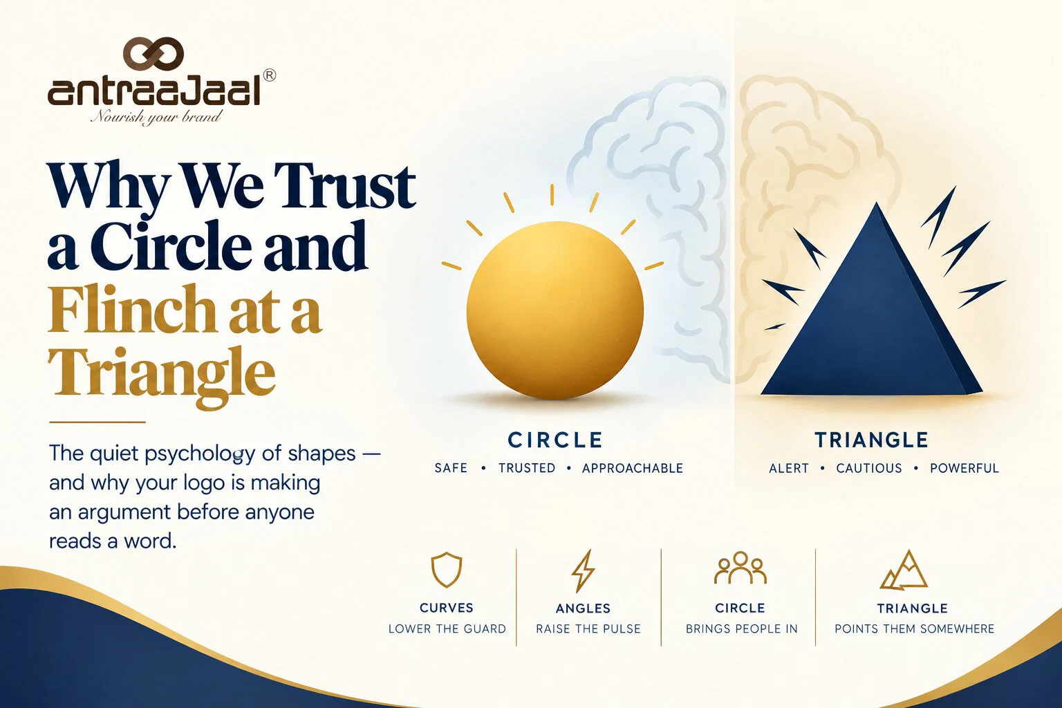
The quiet psychology of shapes — and why your logo is making an argument before anyone reads a word.
Let me show you something you already know.
Here are two shapes. One is a soft, rounded blob — all curves, no corners. The other is a jagged, spiky star — sharp points in every direction.
One of them is called Bouba. The other is called Kiki.
Now, without thinking about it: which is which?
You knew instantly. The blob is Bouba. The spiky one is Kiki. You didn’t reason your way there; you just felt it. And here’s the strange, wonderful part — almost everyone feels exactly the same thing. Ask people across the world, in wildly different languages and cultures. Ask small children who can barely read. The answer comes back the same, over and over, with a consistency that borders on eerie.
That agreement is your first clue that shapes are not neutral. Long before a logo means anything, before you’ve read a single letter, its shape has already reached in and pressed a button you didn’t know you had.
The circle says “safe.” The angle says “careful.”
Psychologists have measured this directly. In a well-known 2006 study, researchers Moshe Bar and Maital Neta showed people pairs of ordinary, emotionally neutral objects — a watch, a sofa, a couch — each in two versions: one with soft, curved edges, one with sharp, pointed ones. Same object. Same function. Only the contour changed.
People preferred the curved version almost every time.
Then they looked inside the brain. Using fMRI, they found that the sharp-angled objects produced noticeably more activity in the amygdala — the small, ancient structure that handles fear and threat. Not a watch that was dangerous. Not a sofa that could hurt anyone. Just the shape of a sharp corner, quietly tripping the brain’s alarm.
Which means the flinch isn’t taste. It’s wiring.
Why the oldest part of you is doing the looking
To understand it, stop thinking like a designer and start thinking like an animal on a plain a hundred thousand years ago.
For almost all of human history, sharp meant danger. A point was a tooth, a thorn, a claw, the edge of a blade, the drop of a cliff. Curves meant safe. A round thing was a river stone, a ripe fruit, a shoulder, a face, the curve of someone you loved. The ancestors who instinctively tensed at the sharp thing and relaxed at the round thing lived a little longer and had a few more children — and they passed that flinch down, generation after generation, all the way to you.
So when you look at a logo, two things happen. First, the ancient animal glances at the shape and decides, in a fraction of a second, approach or beware. Only afterwards does the modern human read the name and think about what the company does. The shape gets there first. The shape always gets there first.
This is why half your favourite brands got rounder
Once you know this, you start seeing it everywhere.
Look at how many brands have quietly softened over the last decade — squared corners rounded off, hard letterforms gently curved, sharp icons smoothed into friendly pebbles. That wasn’t fashion for its own sake. It was a whole industry reaching, consciously or not, for the same feeling: approachable. safe. human. come closer. A rounded logo lowers your guard. It’s the visual equivalent of an open palm and a soft voice. For any brand that wants to feel trustworthy, warm, and easy to be around, the curve is doing quiet, powerful work.
This is also where logo design becomes more than simply choosing an attractive symbol. The decision to use a circle, curve, angle, or point can subtly influence how a brand is perceived before its message is even understood.
But the triangle isn’t the villain
Here’s where it gets interesting — because the flinch is not a flaw. It’s a tool.
That little jolt a sharp angle gives you? Sometimes that’s exactly what a brand wants. Sharpness signals energy, speed, precision, alertness, edge. It says cutting — literally. A triangle points, and pointing means direction, ambition, aspiration; it’s the shape of a mountain peak, an arrowhead, a rocket’s nose. The most enduring monuments humans ever built — the pyramids — are triangles, and they read as permanence and power, not fear. A warning sign is a triangle on purpose: it wants your amygdala awake. So does a sports brand, a performance car, a bold tech startup, a luxury monogram with crisp, confident edges.
You don’t reach for angles when you want to be hugged. You reach for them when “safe and cuddly” is precisely the wrong message — when you want to feel fast, serious, premium, or a little dangerous.
The triangle doesn’t fail. It does a completely different job.
What this really means for a logo
Strip it all back and here’s what’s left: every shape is a tiny emotional argument, made silently, before a single conscious thought arrives.
A curve lowers the guard. An angle raises the pulse. A circle gathers people in; a triangle points them somewhere. Neither is right and neither is wrong — they’re just two different things to say to the oldest, fastest part of a person’s brain, the part that has already made up its mind before the thinking part has even sat down.
For Antraajaal, this same principle is a useful reminder that visual identity is not only about colour, typography, or aesthetics. The shapes within a brand mark can communicate a feeling before the audience consciously processes the name or message.
So the real question a logo asks isn’t “does this look nice?” It’s the same question underneath every good design decision: what do you want them to feel in the half-second before they think?
Safe Round it. Sharp? Point it. But choose — because the shape is going to say something whether you meant it to or not.
Back to Bouba and Kiki
You never really chose your answer, back at the start. You couldn’t have gotten it wrong. Some part of you, far older than your name or your language, took one look and knew: the soft one is gentle, the spiky one is not.
That’s the part of us every logo speaks to first. Good design just remembers it’s there — quietly looking, quietly deciding — long before the rest of us has caught up.

Written by
Dr. Deepika Bahri
Dr. Deepika Bahri is a passionate Branding and Digital Marketing expert with a Doctorate in Marketing, specializing in Brand Strategy and Digital Transformation. With over Two Decades of experience in the media, advertising, and communication industry, she brings a unique blend of academic insight and real-world business acumen. She has also been honored with an Honorary Doctorate for her contribution to Women Empowerment, recognizing her efforts in mentoring, uplifting, and creating platforms for women-led enterprises. Currently serving as the CEO of Antraajaal, a leading branding and advertising agency, Dr. Bahri is committed to sharing insights on branding, marketing strategy, women leadership, and digital growth through her writing and speaking engagements.
Need Expert Guidance?
Antraajaal builds purpose-led brand identities for serious businesses.
Brand strategy, identity and digital presence — one integrated system, built to lead across North India.
Our Services