 Dr. Deepika Bahri
My grandmother kept the family in a shoebox.
Not the living ones — the old ones. The ones in soft, faded photographs with scalloped white edges, the kind where everyone looks slightly surprised to be caught existing. One slow afternoon she tipped the box out onto the bed and let me sort through a century of us.
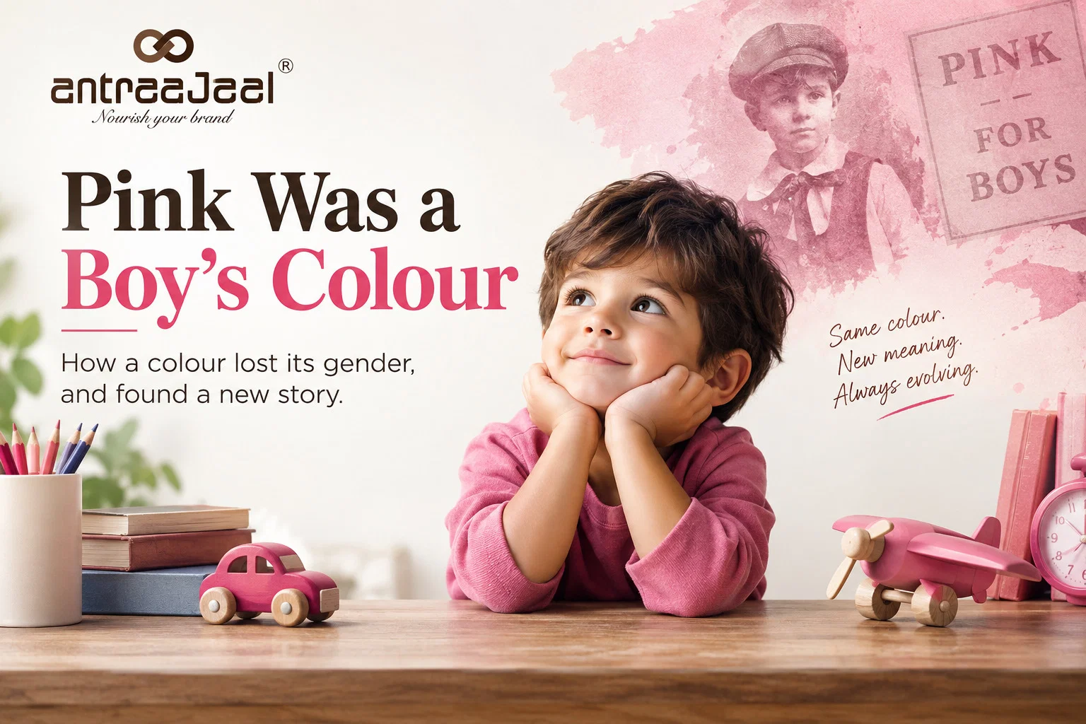
I stopped at one photo. A plump, laughing baby in a pale pink gown, cheeks like two ripe fruit, one sock heroically escaping.
“She’s gorgeous,” I said. “Who is she?”
My grandmother looked over the top of her glasses, and smiled the smile of someone about to enjoy themselves.
“That,” she said, “is your grandfather.”
I want you to sit in the small silence I sat in. Because in that silence, something I had believed my whole life — quietly, completely, the way you believe the floor will be there when you step — simply dissolved. Pink was for girls. Everyone knew that. It was practically a law of nature.
Except it wasn’t. And it never had been.
The colour didn’t change. We did.
For most of history, babies didn’t wear pink or blue at all. They wore white — plain, practical white dresses, boys and girls alike, right up to the age of five or six. The reason was gloriously unromantic: white cotton could be boiled and bleached back to life after a baby did what babies do. Gender wasn’t the point. Clean was the point.
Soft pastel colours only drifted into children’s wardrobes in the middle of the 1800s, and even then, nobody had assigned them a sex. That came later — and when it came, it arrived pointing the opposite way to what we assume today.
In June 1918, a trade journal for children’s clothiers laid down the rule as it stood then, in words that feel almost dizzying to read now:
“The generally accepted rule is pink for the boys, and blue for the girls. The reason is that pink, being a more decided and stronger colour, is more suitable for the boy, while blue, which is more delicate and dainty, is prettier for the girl.”
Read that again. Pink — strong. Blue — delicate. The exact reverse of the “obvious” truth we now hand to newborns.
The logic, at the time, made its own sense. Pink was seen as a little cousin of red — the colour of blood and vigour and boldness, and therefore a boy’s colour. Blue, meanwhile, carried centuries of association with the Virgin Mary: gentle, faithful, feminine. Nobody thought they were making it up. They thought they were describing something real.
A coin that could have landed either way
Here’s the part that should unsettle any of us who work with colour for a living: for decades, the whole thing was genuinely up for grabs.
The historian Jo Paoletti, who spent thirty years tracing this exact question, found that in the 1920s American department stores couldn’t even agree with each other. Some of the biggest names in the country told parents to dress their sons in pink. Others, in the very same year, advised the precise opposite. A parent could cross a state line and have their baby’s colour “corrected.”
It wasn’t until the 1940s that manufacturers and marketers finally settled the coin flip — pink for girls, blue for boys — and only then did it harden into the rule we now mistake for common sense. It locked in even tighter in the 1980s, when prenatal testing let expectant parents learn the sex early and buy a nursery’s worth of the “right” colour months in advance. Which, for anyone selling baby products, was a very good reason to keep the rule firmly in place.
So the colour never had a gender. It had a marketing department.
What this should do to a brand
Here is the lesson, and it is a big one.
Colour carries no meaning in its own right. Pink is a wavelength of light. It doesn’t know it’s supposed to be feminine any more than the sky knows it’s supposed to be sad. Every association a colour carries — trust, luxury, danger, softness, strength — was assigned to it by people, in a particular place, at a particular time, and then repeated so often that we forgot it was ever a choice. We stopped seeing the convention and started calling it nature.
For a brand, that’s not a disappointment. It’s freedom.
It means when you reach for a colour, you’re not obeying a rule written into the universe — you’re borrowing a story culture happens to be telling right now. And stories can be joined, bent, or rewritten. You can lean into the convention when it serves you: a bank in deep blue, quietly promising it won’t lose your money. You can gently break it, when breaking it makes you memorable. And occasionally, powerfully, a brand can reclaim a colour entirely — take pink, the colour we were taught meant “sweet and small,” and make it mean bold, loud, unapologetic instead. Which is exactly what some of the sharpest brands of the last decade have done.
The mistake — the only real mistake — is treating a colour’s meaning as fixed. Because the baby in that photograph is proof it isn’t. Within a single lifetime, pink walked all the way across the room, from the boys to the girls, without ever changing shade.
Back to the shoebox
We put the photos away as the light went. My grandfather, that laughing baby in pink, went back into the box with all the others, none of them any longer sure of anything I’d assumed about them.
I’ve thought about that afternoon every time a client has asked me, with total confidence, whether a colour is “right” for them. Because the honest answer is: right for now. Right for here. Right for the story we’ve all currently agreed to tell.
A colour is only a colour until we agree what it says.
And the wonderful, freeing, slightly dangerous truth of branding is this: we can always agree on something new.

Written by
Dr. Deepika Bahri
Dr. Deepika Bahri is a passionate Branding and Digital Marketing expert with a Doctorate in Marketing, specializing in Brand Strategy and Digital Transformation. With over Two Decades of experience in the media, advertising, and communication industry, she brings a unique blend of academic insight and real-world business acumen. She has also been honored with an Honorary Doctorate for her contribution to Women Empowerment, recognizing her efforts in mentoring, uplifting, and creating platforms for women-led enterprises. Currently serving as the CEO of Antraajaal, a leading branding and advertising agency, Dr. Bahri is committed to sharing insights on branding, marketing strategy, women leadership, and digital growth through her writing and speaking engagements.
Need Expert Guidance?
Antraajaal builds purpose-led brand identities for serious businesses.
Brand strategy, identity and digital presence — one integrated system, built to lead across North India.
Our Services