MOFI
T-SHIRT MANUFACTURING · CHANDIGARH TRICITY
The Name Had to
Work on a Tag at
1 Centimetre
Before a single logo was sketched or a colour was chosen, Antraajaal started with the name. Because for an apparel brand, the name is sewn into every garment, printed on every tag, spoken by every customer who recommends the brand to a friend. It had to be right.
The naming brief was precise: short enough for a neck label, distinctive enough to be owned, modern enough to appeal to the 18–35 demographic the brand was targeting, and strong enough to carry the brand as it scaled from a direct-to-consumer start to a wholesale and retail presence. It also had to work as a URL and an Instagram handle without conflicts.
MOFI — four letters, two syllables. Crisp to say, easy to spell, impossible to mistake. The name carries the energy of movement and self-modification — modify yourself, express yourself — without being literal about it. It sits in the same register as the confident, clean brand names that dominate the modern apparel space: short, modern, yours.
The brand positioning was built around a specific truth about the young Indian apparel buyer: they don't want to wear what everyone else is wearing, but they also don't want to try too hard. Mofi's brand personality — quietly distinctive — lives in that space. Clean cuts, original graphic language, quality that speaks without a logo emblazoned across the chest.
The best apparel brand names feel like they always existed. Mofi landed that way — the moment it was said aloud, it felt like it had already been around for ten years.
A Logo That Fits
on a Tag and
Owns a Billboard
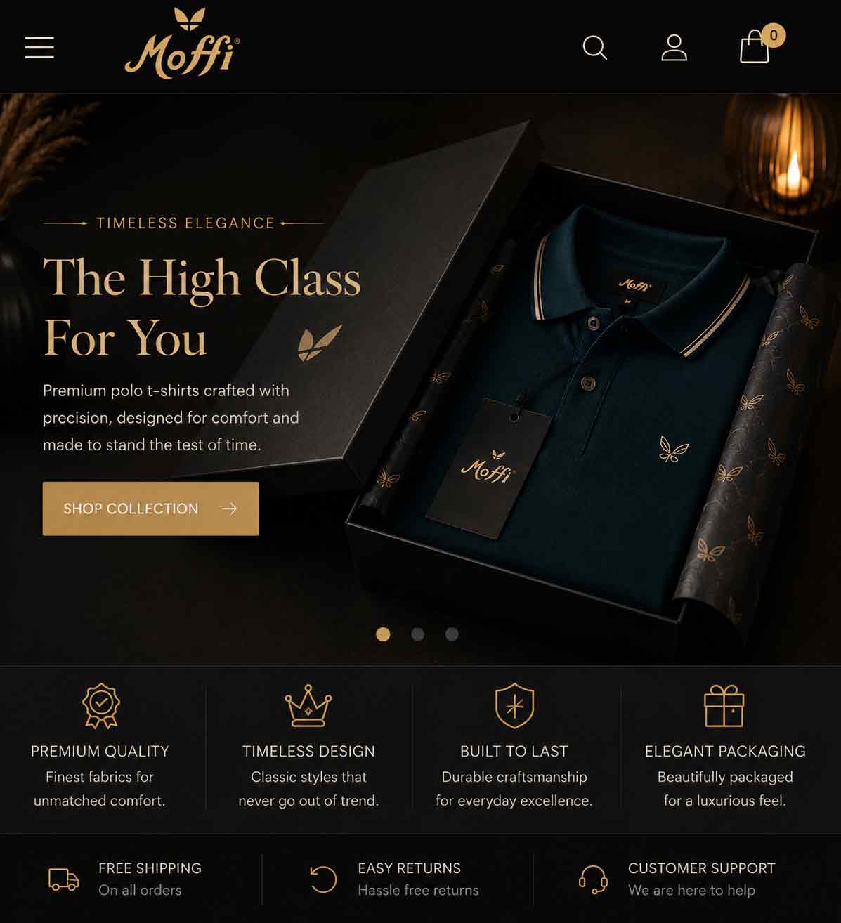
The Mofi logo was designed to function at every scale — from a 1 cm neck label to a full-width storefront. The wordmark uses a custom-weight geometric sans with the last two letters in Mofi Lime, creating a subtle chromatic split that gives the mark energy without complexity.
The palette is deliberately minimal: jet black, Mofi Lime, clean white, and a mid-grey for supporting roles. This restraint is strategic — in a clothing brand, the palette needs to work with the garments, not compete with them. Black and white are wardrobe staples; lime is the flash of personality that makes the brand recognisable.
Space Grotesk as the brand typeface signals the same quality tier as other contemporary apparel brands — informed by Helvetica's authority, refreshed for the current moment. The brand guidelines covered all logo variants, minimum sizes, colour combinations, and on-garment applications.
An apparel brand's identity doesn't sit in a PDF. It lives on fabric, sewn in, worn out, seen by strangers. Every decision was made for how it would look at the end of a human arm, not on a screen.
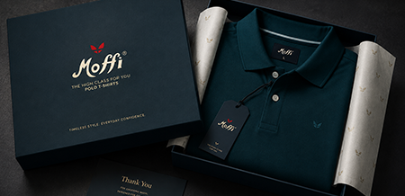
Unboxing Is
Part of the Product
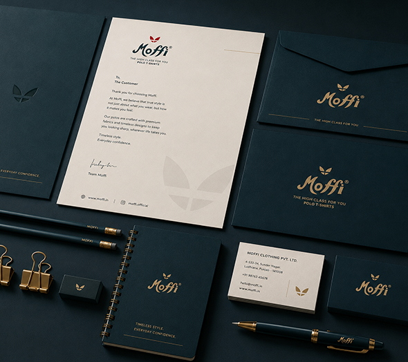
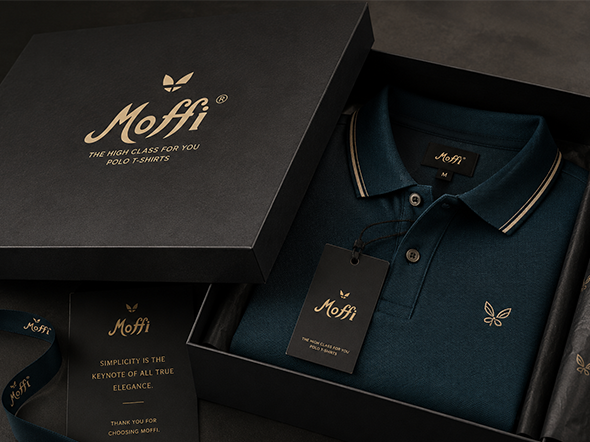
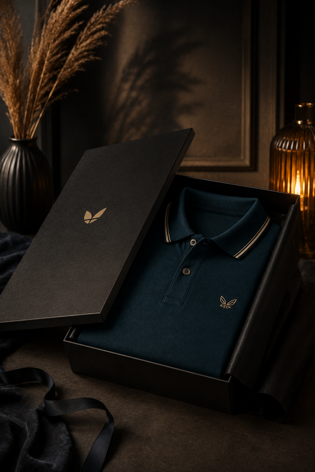
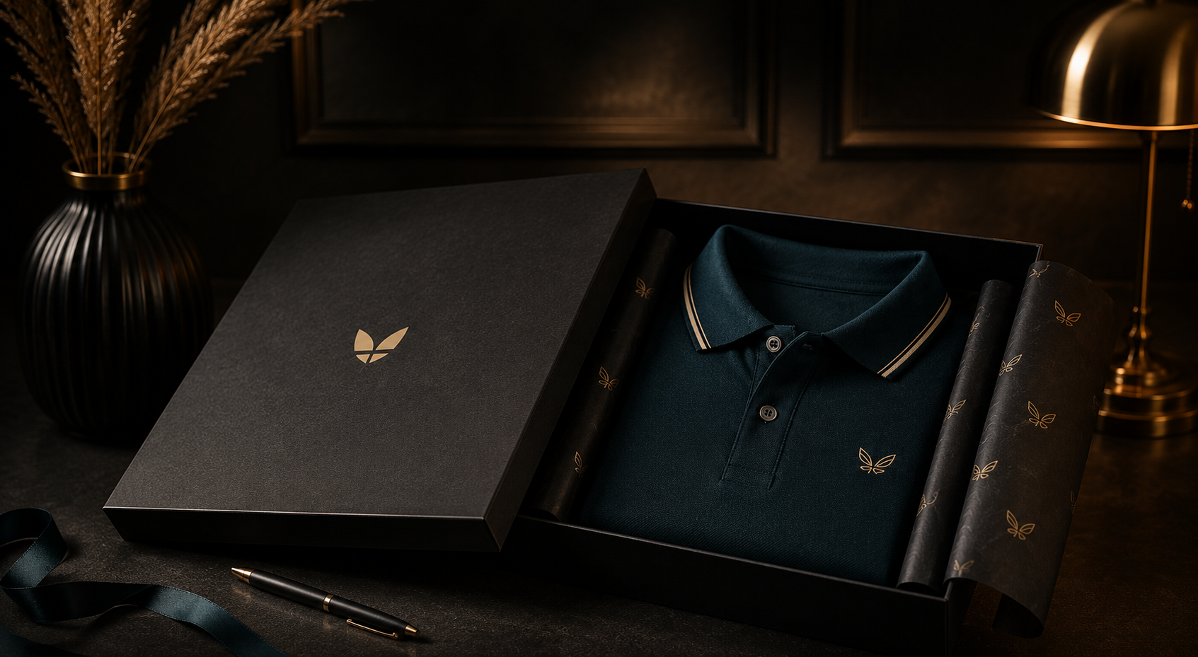
In direct-to-consumer apparel, the packaging is not the wrapper — it is the first physical touch with the brand. Antraajaal designed every layer of the Mofi unboxing experience to feel considered.
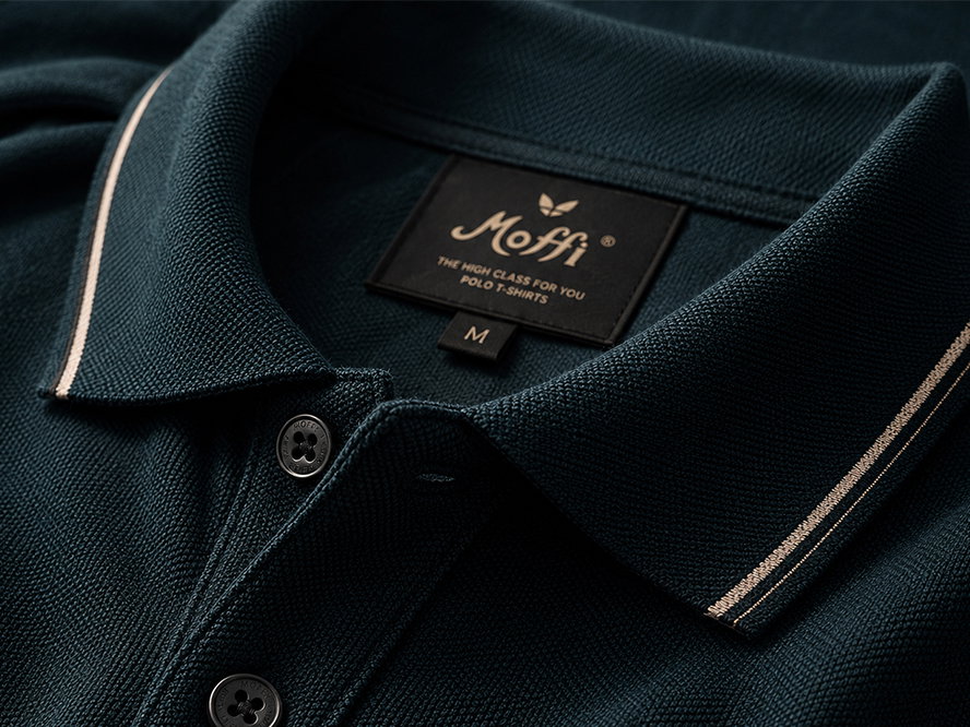
Premium hangtag in jet black with the Mofi wordmark embossed in lime foil. Reverse side carries brand story, care symbols, and a QR code linking to the Mofi website. The tag says: this is a brand that thinks about every detail.
Woven neck labels in black with MOFI in white and the size indicator in lime. Soft-touch finish. Printed labels for interior care information — clean typography, consistent brand language inside the garment as well as outside.
Frosted poly mailer bags with the MOFI wordmark in a large lime ghost print — visible through the frosting as a decorative brand element. Resealable. Printed with care instructions for the bag itself, signalling environmental awareness.
Rigid gift box in matte black with debossed Mofi logo for premium gift orders. Black tissue paper with lime MOFI repeat pattern — the kind of unboxing that gets photographed and posted. Every layer of the unwrapping experience was designed to reward sharing.
Launched on
Instagram.
Grew From There.
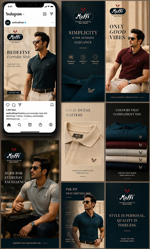
Brand Reveal Strategy: Antraajaal built a pre-launch Instagram presence for Mofi — a 2-week teaser campaign before the first product drop. Black and lime grid, countdown posts, product silhouette reveals, and "coming soon" story content that built a following before a single product was available to buy. The first drop had an audience waiting for it.
Content System: Instagram content was built around four pillars — PRODUCT_SHOTS (clean flat lays and model shots in the brand palette), LIFESTYLE (Mofi tees in real contexts, real people), BEHIND_THE_BRAND (manufacturing process, quality stories, the people making the clothes), and DROP_ALERTS (new colour, new design, limited run). The grid was treated as a single designed surface — black, white, and lime alternating to create a feed that looked intentional from the first post.
Website + Ecommerce: Mofi's website was built as a minimal, fast-loading direct-to-consumer store — black background, products centre-stage, easy size selection, WhatsApp ordering integration, and an SEO architecture targeting "buy t-shirts online India", "premium plain t-shirts", "graphic tees Chandigarh".
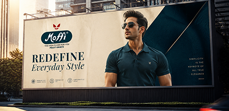
Paid Social: Meta campaigns targeted fashion-interested 18–32 year olds across Chandigarh, Delhi, Mumbai, and Bangalore — the primary markets for direct-to-consumer apparel. Retargeting campaigns for website visitors with cart abandonment. Influencer gifting programme for micro-influencers in the streetwear and lifestyle space.
A clothing brand's Instagram isn't a catalogue. It's a world. Every post is an invitation to live there for a moment. Mofi's feed was built to make people want to live in it.
It launched a brand position —
and the market noticed.
Numbers That Prove
The Brand Works.
Everything Built.
Nothing Outsourced.
The Full
Mofi World

From Zero
To Brand.
Identity & Packaging
- Mofi™ — name owned across all platforms
- Logo system for all applications — garment to digital
- Full packaging suite — hang tags, labels, bags, boxes
- Brand guidelines document produced
- Ready to scale — every asset production-ready
Digital Presence
- Instagram presence built — pre-launch to ongoing
- DTC website with ecommerce — live and optimised
- 6-week launch timeline — brief to first drop
- Influencer gifting programme activated
- Meta Ads — DTC and brand awareness campaigns
Sales & Scale
- 3× revenue growth in first 6 months
- Instagram as primary sales driver (44% of orders)
- Wholesale channel opened — B2B growing
- Repeat purchase rate — strong customer retention
- Brand position established in Tricity apparel market
I had the manufacturing capability and the product quality. Antraajaal gave me the brand, the packaging, the Instagram presence — everything that turns a good t-shirt into something people want to buy and be seen wearing. Mofi wouldn't exist without them.
// MOFI · T-SHIRT BRAND · CHANDIGARH TRICITY