"We envision a world where there is no dearth of quality medicines & healthcare services."
SR Biotec
A pharmaceutical company with a mission to make quality medicines universally accessible — Antraajaal designed the complete packaging system: every medicine box, every LBL, every label that carried the SR Biotec promise from the production line to the patient's hands.

Research-Driven.
Innovation-Led.
Packaged with Precision.
SR Biotec operates with a singular purpose — to make quality medicines available where they are needed. The company's vision, "a world where there is no dearth of quality medicines and healthcare services," is not a marketing statement but a genuine operating philosophy. Innovating through research, generating ideas that harness therapeutic market needs, and bringing those ideas to patients through products that are as carefully presented as they are carefully formulated.
In pharmaceuticals, the journey from research to patient passes through one critical physical moment: the moment the medicine reaches the person who needs it. That moment is shaped entirely by packaging design for medicines — the box the patient receives, the label they read, the leaflet inside that tells them how to use the product safely. Antraajaal's engagement with SR Biotec was built around that moment.
The brief was comprehensive: design the complete pharmaceutical packaging system for SR Biotec's product range — from the primary brand identity applied to packaging, through every individual medicine box and label, to every LBL that accompanied each product. Every piece of packaging design for pharma delivered to production-ready specification, compliant with Indian regulatory standards, and consistent across the range as a single brand.
To generate innovative concepts & ideas to harness market needs and synergies across therapeutic areas. Antraajaal's role: to make every product that emerged from that innovation look as credible and trustworthy as the science behind it.
Every SR Biotec Box
Designed to Build
Trust Before the First Dose.
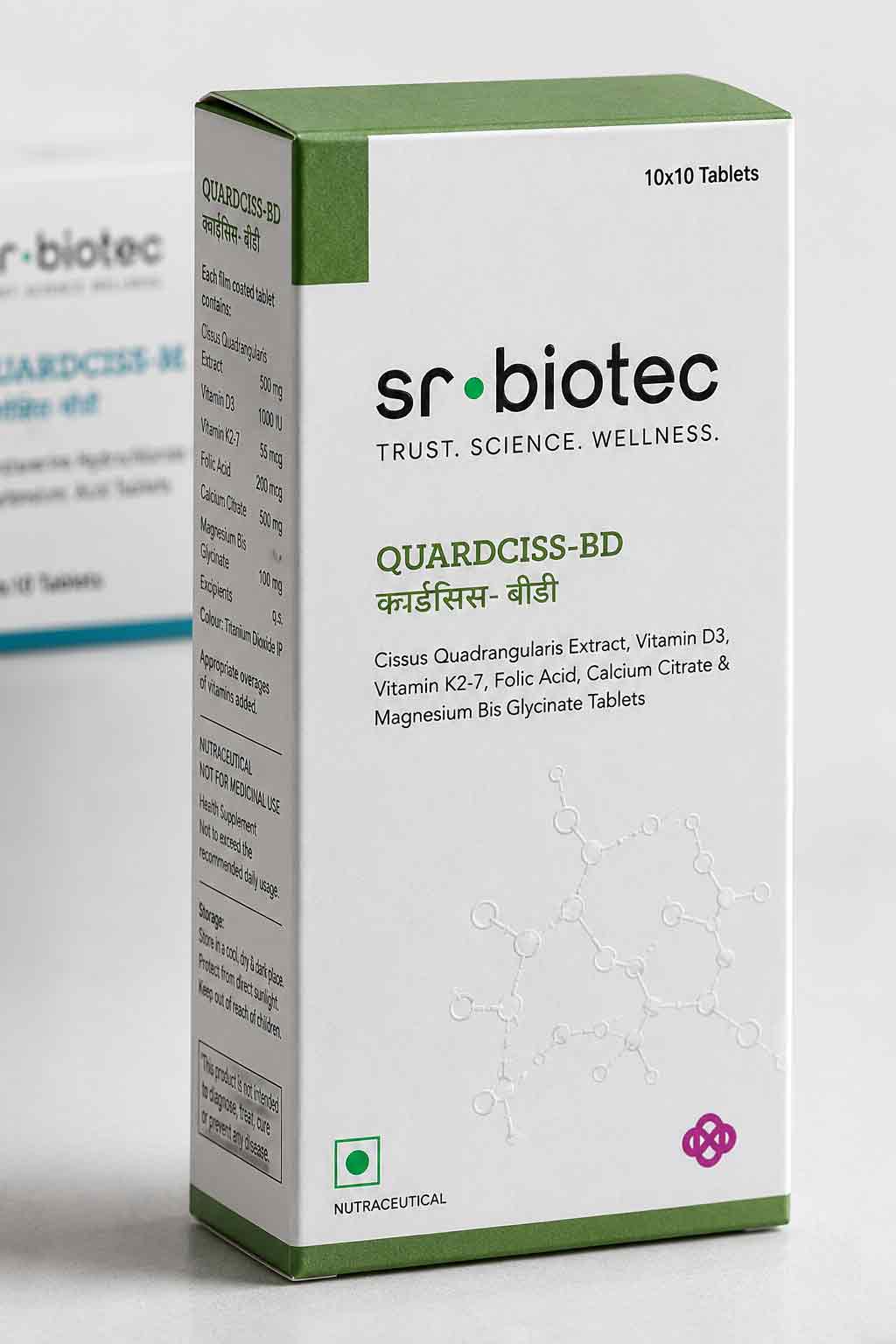
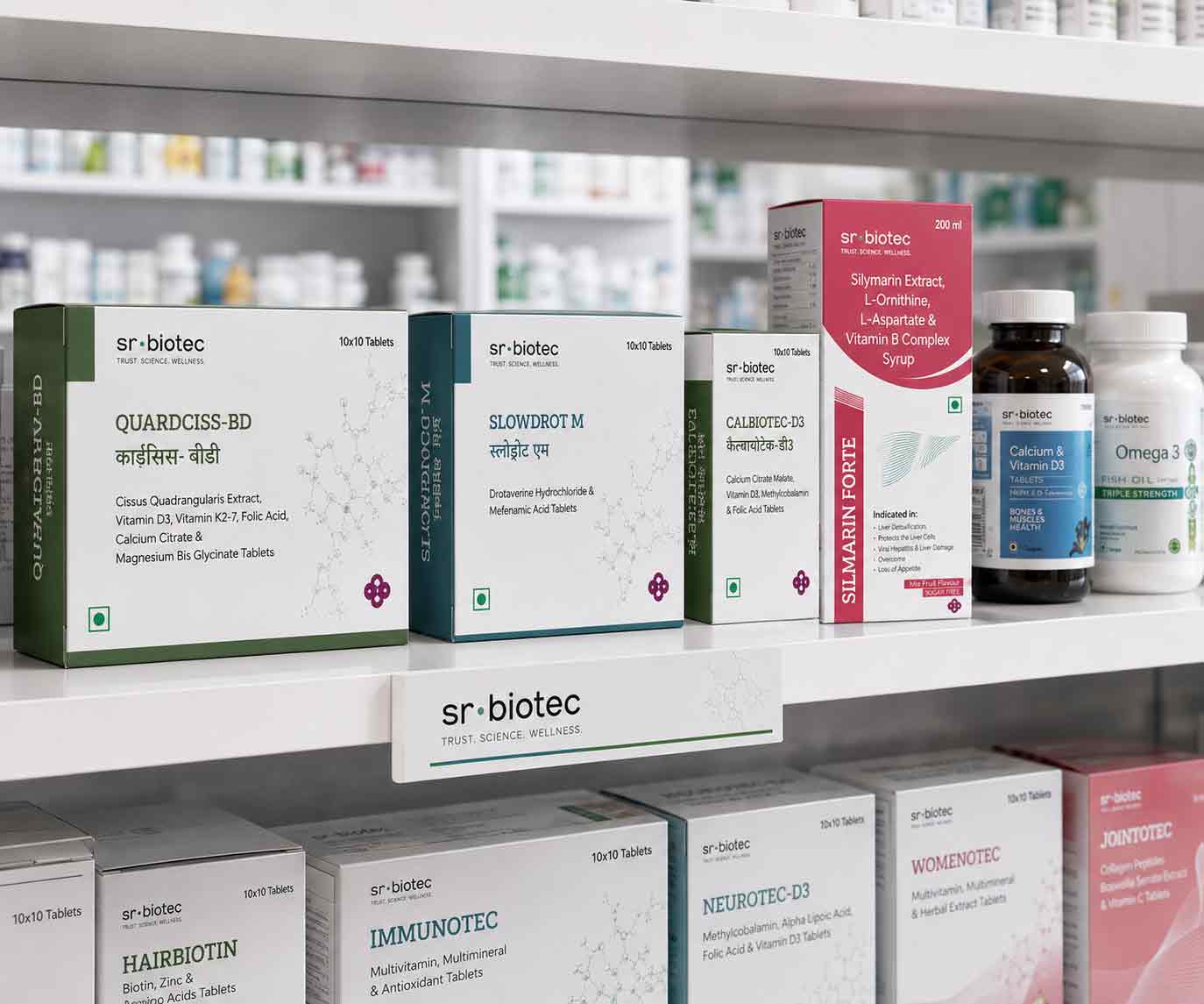
The medicine box is the first physical experience a patient or pharmacist has with any pharmaceutical product. In the 3 seconds between picking up a box and deciding to dispense or purchase it, the packaging communicates the company's quality standard. Antraajaal designed SR Biotec's boxes to win every one of those moments.
The SR Biotec identity was engineered into the top band of every medicine box — creating an instantly recognisable brand header that pharmacists and doctors learned to associate with quality and consistency. Brand mark, company name and the indigo-teal colour system applied with precision across every SKU in the range.
The brand name of each medicine, its generic (INN) name, and its strength were set in a clear three-tier typographic hierarchy — large brand name for recognition, smaller generic name for compliance and clinical reference, strength prominently displayed in a teal-backed callout. A pharmacist could read the critical information in under two seconds.
Batch number, manufacturing date, expiry date, Schedule H/H1/OTC designation, storage conditions, MRP, net quantity — every mandatory element of pharmaceutical packaging positioned in compliance with CDSCO guidelines, printed at the correct minimum type size, and given the visual weight it needed to be found immediately.
Every box design delivered as production-ready print artwork — CMYK colour separations, correct bleed and trim marks, all typography outlined, all images embedded at 300 DPI. Artwork that went directly from Antraajaal to the press with zero preparation required by the printer. The standard that professional pharma packaging design demands.
The Leaflet That
Turns a Medicine
Into a Safe One.
The LBL — Label Binding Leaflet, also called the package insert — is the most regulated and most read printed document in pharmaceutical packaging. It contains the complete clinical and regulatory information for a medicine: composition, pharmacology, indications, contraindications, dosage, drug interactions, side effects, storage conditions and the manufacturer's full details. For every SR Biotec product, Antraajaal designed an LBL that met every regulatory requirement while remaining genuinely readable by the patients it was intended to inform.
Information Architecture: Before any LBL is typeset, the information must be architected — sequenced in the order that clinical logic demands, segmented into sections that a doctor, pharmacist or patient could navigate independently, and written in a hierarchy that distinguished mandatory regulatory text from clinical guidance. Antraajaal designed a master LBL template for SR Biotec that standardised this architecture across the entire range, ensuring every product's insert was immediately navigable to anyone familiar with any other SR Biotec LBL.
Typography at Small Scale: The challenge of LBL design for pharma is readability at extremely small type sizes within a severely constrained physical format. A standard LBL must contain thousands of words on a sheet that folds to fit inside a medicine box. Antraajaal selected typefaces with open letter forms, specified generous line-height relative to font size, and used clear bold-to-regular weight contrast between section headers and body text — making the SR Biotec LBLs more readable than most competing products in the same category.
Brand Consistency: SR Biotec's LBLs carry the brand identity at the header — company name, logo mark, corporate colour band — ensuring that even the most utilitarian document in the packaging suite communicated the brand. A doctor unfolding an SR Biotec LBL saw the same company that was on the box, reinforcing brand recognition at every clinical interaction.
An LBL that isn't read is packaging that has failed its patient. Antraajaal designed every SR Biotec LBL to be clear enough, well-structured enough, and easy enough to navigate that reading it was not a chore but a reassurance.
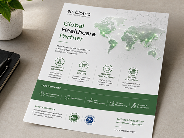
Packaging Designing
for Pharma Isn't Just
Design. It's Trust.
In the pharmaceutical industry, the quality of a company's medicine packaging design directly affects how much a doctor, pharmacist, and patient trusts the product. Antraajaal's expertise in packaging designing for pharma means SR Biotec's products never have to fight for credibility before they've been prescribed.
A doctor reaches for a sample or writes a prescription based partly on what they know about the brand and partly on what the physical packaging communicates. A well-designed medicine box projects clinical credibility before the efficacy data is even reviewed.
A pharmacist dispensing from a shelf of products will pick the product that is easiest to read, fastest to verify, and clearest in its critical information. Good pharma packaging design wins at the dispensing counter before the patient arrives.
A patient holding their medicine for the first time is looking for reassurance that this is correct, that this is safe, that this will help. Packaging that communicates clearly and professionally gives them that reassurance — and builds the repeat trust that drives brand loyalty in healthcare.
Complete Pharma Packaging
Design — Every Element.
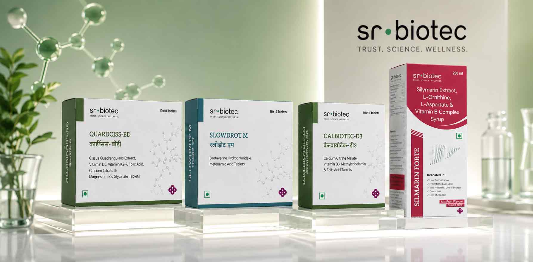
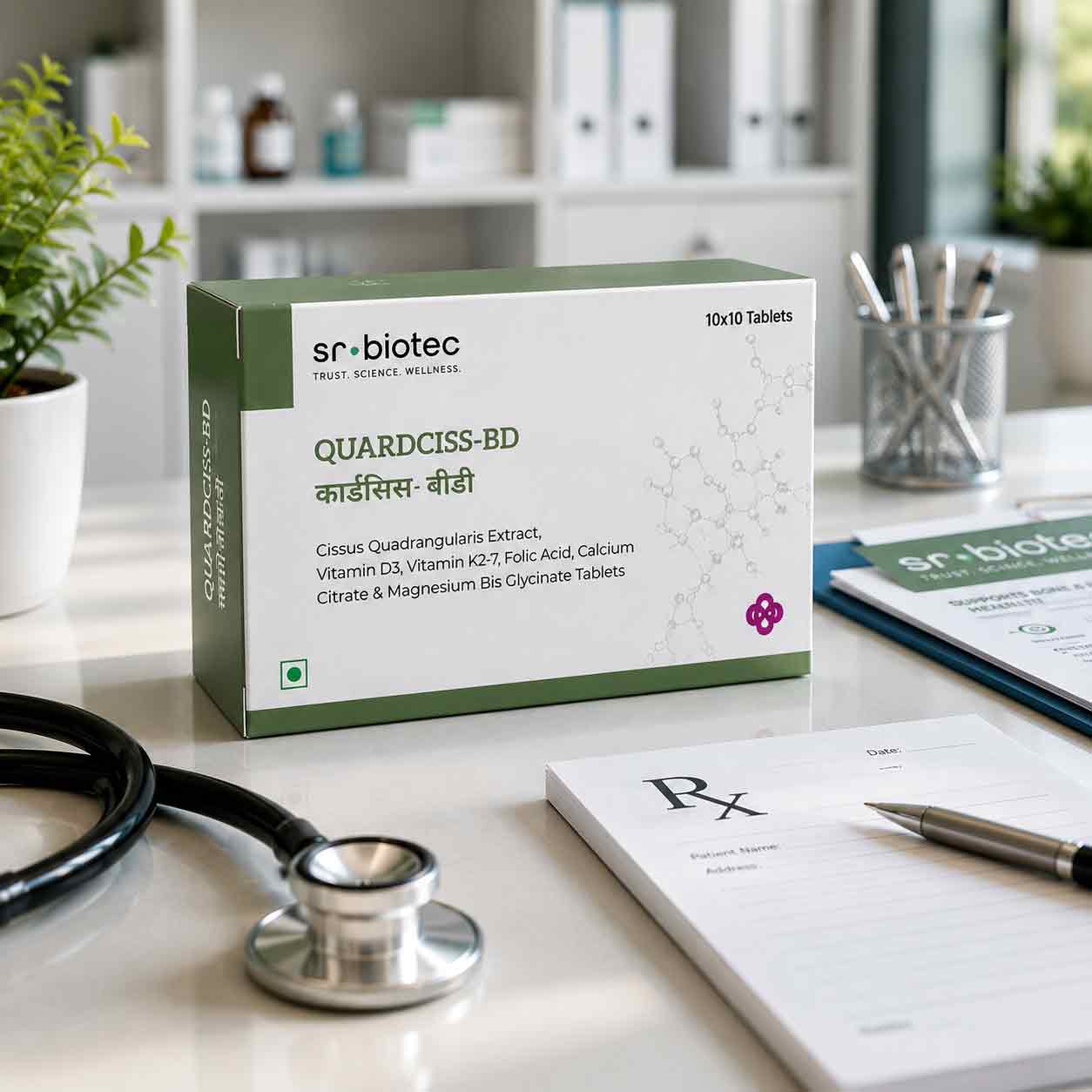
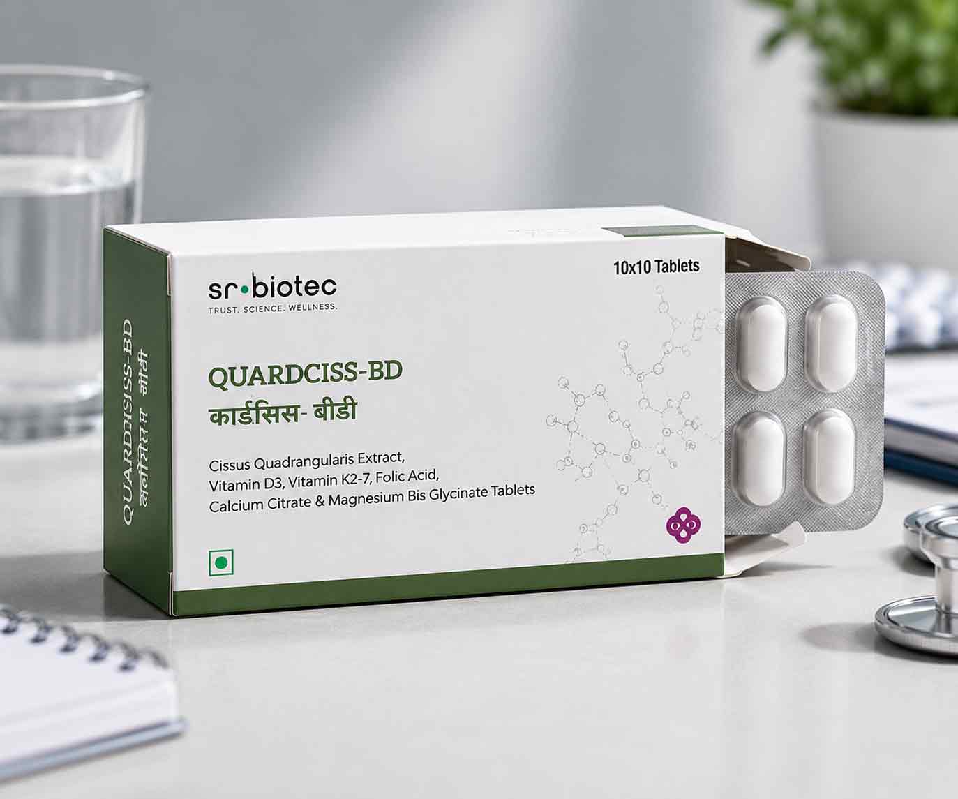


Pharmaceutical Packaging
Built to the Highest Standard.
Medicine Boxes
- Complete SR Biotec medicine box design system
- Brand zone architecture on every pack
- Product name hierarchy — three-tier typographic system
- All regulatory elements precisely placed — CDSCO compliant
- Print-ready artwork for all pack formats and sizes
Package Inserts
- LBL design for full SR Biotec product range
- Master information architecture — standardised structure
- Readable typography — open forms, correct weights
- Bilingual layouts where required
- Brand header — SR Biotec identity on every leaflet
Complete Identity
- SR Biotec logo mark and brand identity
- Indigo-teal-coral — research, innovation, life
- Master packaging templates — all dosage forms
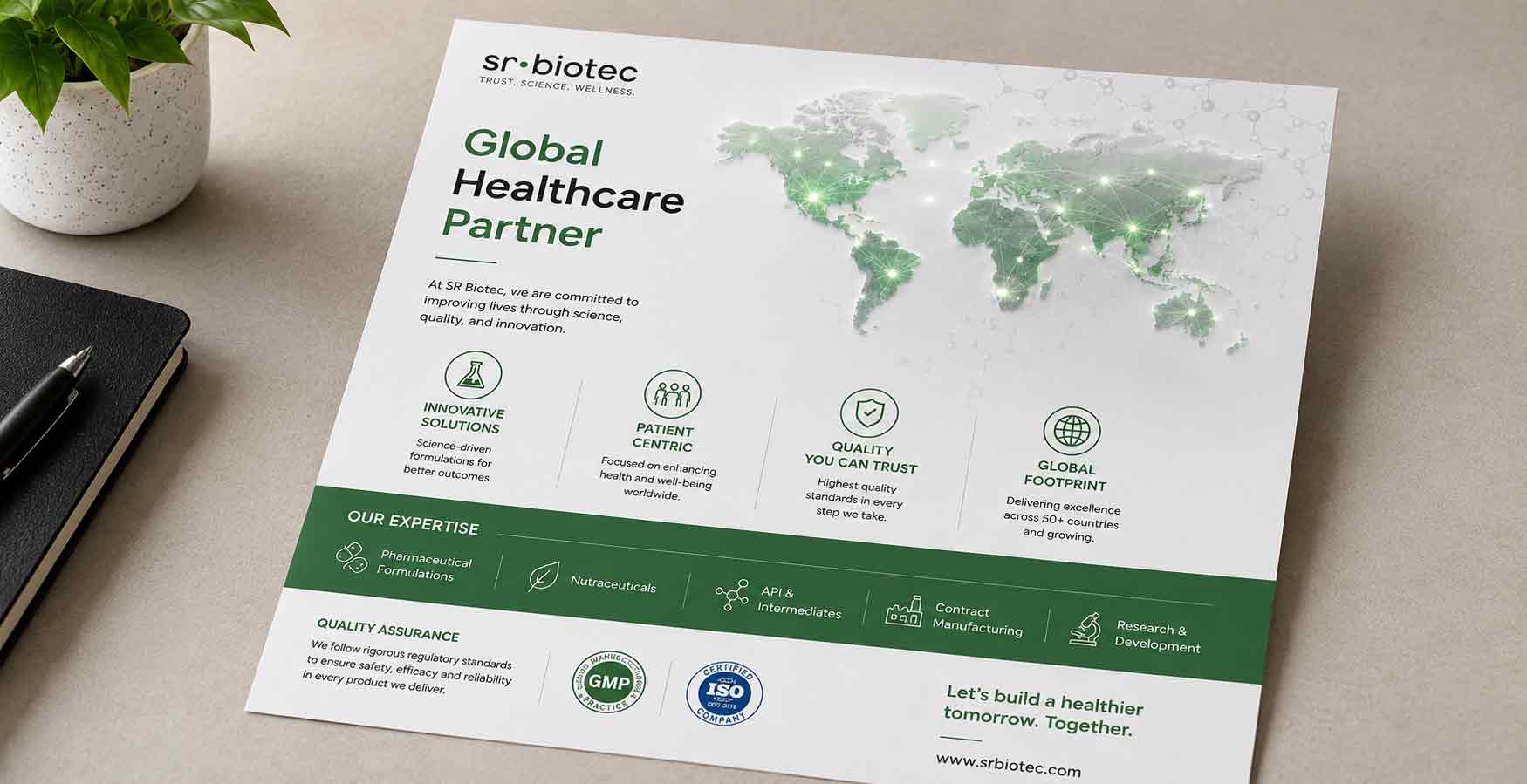
- Promotional literature for MR presentations
- Brand guidelines for consistent future execution
Our mission is to make quality medicines universally accessible. Antraajaal understood that every box and every leaflet was a moment of that mission — a patient's first contact with a product we'd invested months in developing. They designed our packaging to communicate that quality exactly as it deserved to be communicated.
— SR Biotec | srbiotec.com | Pharmaceutical Company